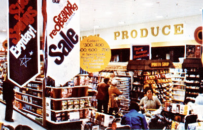
Somers Point store photos courtesy of Michael Lisicky
This decor package began in the 60's and was used until the mid 80's. As you can see in the photo above the package didn't start out with a lot of colonial flare. It really hit it's full stride in the 70's and was the standard decor for nearly all Acme stores during that decade. The decor was officially retired when the 80's remodel swept through most of the chain. Some stores were passed over for remodels and kept this decor until the late 90's.
The Produce Department flooring. Introduced well into the 70's when this decor package became more deluxe for newer stores and some remodeled stores.
The 70's lettering still in place over the Deli at the Sea Isle City store! The store has been remodeled with what looks like bits and pieces of several different decor packages... some of which were probably brought in from stores that closed. Thankfully they left the old Deli sign in place!
The Meat Department signage was virtually the same in every Acme throughout this era.

The abandoned Brown Mills store still has remnants of the Colonial decor. The walls were painted beige at some point with the signs left above each department. When the letters were removed, the original wall colors were revealed.

The abandoned Brown Mills store still has remnants of the Colonial decor. The walls were painted beige at some point with the signs left above each department. When the letters were removed, the original wall colors were revealed.

The fish-eye logo which was used from the early 60's all the way through to 1986. This sign remained on many stores well into the 90's. The store in Manasquan, New Jersey is the very last stores to still have the world's most awesome supermarket sign!
Some great pictures from the American Stores 1978 Annual Report showing off the very deluxe version of the 70's Colonial Decor package...
Some great pictures from the American Stores 1978 Annual Report showing off the very deluxe version of the 70's Colonial Decor package...
The lamps on the wall were a big feature to the deluxe version of this decor package. They were not actually wired to anything so they were never lit.
I do hope to track down a photo of the Bakery wall paper. It was very 70's with a brown and gold foil pattern. Still holding out hope that will get to see it again someday!


Takes me back ... my favorite design ... both Acmes in my hometown of Nanticoke had this design ... I could almost picture myself walking into the store with my grandmother and seeing the green "Produce" on the wall ... between the "Produce" and the Lancaster Brand Meats in the back there was a blue section that said "Pet Foods" on the wall ... but for some reason that is where they always kept the soda.
ReplyDeleteThis decor is what I grew up with in Pa. We had a pitched roof store in Shamokin Dam, PA with the super saver sign on the front. Never the block acme sign. I remember going down after the store after it had relocated to the susquehanna mall and look into to the empty store. All of the signage was left up even the old grocery asile signs. The only items that went to the new store were the center store shelves. The cooler cases were left. this store sat empty for along time until giant came in and tore down the store and built a new giant. Sadly the new acme they built at the mall was sold to bilo and lasted a few month afterward. then closed. Weis came in and tore most of that store down to build a new restaurant. The only thing the remains of acme in selinsgrove is the loading dock of the weis store. There is an old acme in Lewisburg pa that is a save lot run by weis to keep giant out.
ReplyDeleteHello all. The old "fish eye" logo was replaced by a red "football" shaped logo in 1980 and within a year that logo left and was changed into the red oval logo seen in most Acme's today. The fish eye logo is still a part of Acme at the Jersey Shore in Manasquan, New Jersey. I was told that during the remodel of store 7925, Clayton New Jersey, that the fish eye logo was put outside overnight and when the vehicle came to the store to pick it up....well someone must have it in their basement.
ReplyDeleteThe "football" shaped logo was used on packaging and uniforms but was not used as the main exterior sign. The "fish-eye" logo remained on the outside of stores until the 80's remodel in 1986 when stores received the red oval logo. The red oval logo is long gone from stores now. It has been replaced with the the early 90's block letter logo. The only store I know of that still has the red oval logo is the Fallston store in Maryland. The fish-eye sign above is from the Manasquan store.
ReplyDeleteWhat was used in the '50s when they knew what the outside would look like, but colonial Hadn't come out yet.
ReplyDelete