

Welcome to the 2000's... when Acme was officially transformed into Albertsons. New Acmes were nothing more than cookie-cutter Albertsons that were being built in several areas of the country. From my experience, this decor tends to be the most hated decor in Acme's history.

This decor, which includes the interior as well as the exterior, is referred to as the "Santa Fe" package within the company. Here at Acme Style it is referred to as "Albertsons Marketplace". The look, unlike the ones before, is synonymous with Albertsons and the "Marketplace" comes from the signage above the grand aisle in many new stores.
The Santa Fe package was used for the construction of brand new stores. Only a hand full of new Acmes got the entire look inside and outside. The Clifton store above is one example. The Sav-on signage came a few years after the store opened. Other stores were remodeled with this decor often times on the cheap when the remodel was more of a "re-paint".

Here we'll take a look at the department signage around the store...
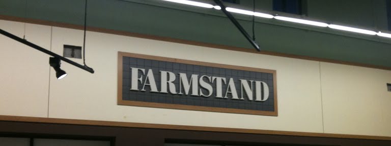
Some of the signage... not very exciting. The first time I stepped foot into one of these stores my first thought was "oh, they're trying to look like Whole Foods now." Many chains were doing exactly that in the 2000's by switching to earth tones for their color schemes and creating a more "healthy" looking environment in their stores.

I need to get better shots of the blue light boxes above the service departments. One of the more dramatic aspects of this decor package.


The promotional signage above, while not considered decor, was present in nearly all of the Albertsons Marketplace stores.

Frozen Food floor. A little hard to see here. I do like the design and the color combination.

Acme's new, unique registers. I'm not sure how they work exactly. I'm assuming the round section rotates to move items around to the bagging area. Certainly a style of register not seen much on the east coast. You can see the automatic change dispensers on the left side of the register. Acme has had them for years now. It would be interesting to to know how much the company saves each year by having a fool-proof change dispensing system.

The interior of the abandoned West Chester store. Here you can get a good look at the original aisle markers for this decor package. They are disappearing rapidly as stores are now receiving the "Premium Fresh and Health" aisle markers in their place.

The new aisle markers. Stores of all decor packages are receiving these without getting a full remodels. This picture, as well as all the ones below, come to us from Nintendo85's flickr collection. You will certainly recognize his name from all the great comments he leaves here at Acme Style. He allowed me to post them here as I discovered that my own collection was falling a bit short for this decor. Be sure to check out his entire collection on flickr by clicking here. He has more pictures of the Sicklerville Acme which you can see by clicking here.

The new aisle marker package come with signs for the whole aisle pointing out the various categories. Personally I think the signage looks great and can be extremely helpful when shopping in large stores that you are not familiar with. What I absolutely hate about it the use of the Albertsons leaf on the aisle signs. The leaf has an even bigger presence in new decor packages... which does nothing but remind Acme fans that Acme isn't Acme... anymore.

Great shot of the "Marketplace" area. I will say that Produce merchandising has improved greatly in many of these newer stores. At the same time... I'm not a big fan of the new "warehouse" atmosphere. There always seems to be alot of wasted space particularly around the perimeter of the stores.

The blue light boxes are turned off here. The store was getting ready to close when Nintendo85 was snapping these pictures.


Coming up next... the most recent Acme decor package, by it's official name, "Premium Fresh and Healthy". That post will be followed by the very special, the very limited edition decor package... "Acme Theme Park". It was used in the early 2000's but will be saved for the grand finale of the decor posts!
What I really hate about this decor package is the fact that the store is lacking a ceiling, which leaves all of the HVAC units (and other pipes) completely exposed. In my opinion, such a look is both tacky and extremely ugly.
ReplyDeleteHowever, I certainly don't want to single out Acme for doing this: I know that several Stop and Shop locations lack a ceiling and have their pipes exposed, as does an A&P Fresh Market in Denville, NJ. For some unfortunate reason, such a look seems to be the "in thing" among those who design modern day supermarkets.
This is actually more synonymous with Jewel than Albertsons. I've heard this referred to as the "Jewel" decor package more often than not. I actually like the full version of this package - impressive signage, huge displays of produce and service department, and a big, warm feeling.
ReplyDeleteThe repaints, though... not so much. Those really looked cheap and it's not hard to see the store's original look hidden underneath.
And this did roll out around the time that Acme became Albertsons. That's when they began taking Albertsons slogans, Albertsons-style advertising, Albertsons packaging designs, Albertsons decor package, Albertsons uniforms... they might as well have put an Albertsons leaf on all the stores like they did in California when they killed off Lucky.
There's one more decor that I think you're leaving out, and I believe it is referred to in the company as "Marketplace". I don't believe it made it to very many stores, but it may still be at the Pennypack store on Roosevelt Boulevard. Lots of faux-awnings, huge exposed ceilings, and Albertsons signage EVERYWHERE.
Thanks Matt! I completely forgot to mention the Jewel connection which I only recently learned about. This decor package was created by Jewel and was adopted by Albertsons when they purchased American Stores back in '99.
ReplyDeleteI have not seen the "Marketplace" decor. I'll stop by the Pennypack store on my next road trip to see if it's still there.
There are actually two variations of this decor package. Out of all of them I like this one the best. One can be seen slightly in the Collegeville post. They basically used the blue block lettering and just placed it on the walls. Two other stores I know of that have this are Exton PA and Westtown, PA.
ReplyDeleteThe other style is VERY close to this. The only difference really is it does not incorporate those cool blue boxes to the left and the right of the dept signs. And the signs have spot lights shining on them as apposed to light from behind. The store in broomall pa in the Lawrence park shopping center has this look i believe.
Stores with the letters just placed on the walls got the cheap remodel version of the decor. I'm not familiar with the other version you are talking about. Hopefully I will stumble across it one of these days.
ReplyDelete