BEFORE >>>
AFTER >>>

Just before the holidays, I spotted some updated ice cream cone boxes at my local Acme. Wasn't in the market for cones but the new packaging caught my eye. I was immediately impressed with the new design and the vastly improved logo. The awful Signature Kitchens logo, which replaced Safeway's logo on the products to make them multi-banner friendly, is getting phased out. In my opinion, it never should have seen the light of day in the first place. The white "Signature" logo is barely visible on most of the packages. Add to that the awful leaf growing out of the "h" which brings back memories of Alberstons plastering their leaves all over Acme. Now the logo has been redone as an eye-catching black tag with the words "Signature Select Quality Guaranteed". "Signature Select", which was previously used on the higher-end items, appears to be transitioning to the standard name for all private label products. It's impossible to confirm for sure since the new packaging is just now popping up in random categories throughout the store.

The Signature brands are thankfully losing their generic elements for more uniquely designed elements. The new packaging for the cones makes them look more like a specialty product rather than a mass produced generic brand.
TOO MANY BRANDS!
The image above is from Acme's website showing all of their in-house brands. Ever since Safeway's brands came to Acme I thought there were too many of them. I even had a neighbor tell me "I can't figure out their brands". Who can? It's branding overkill. 19 private-labels shown above and they didn't include the logo for the Value Corner brand! Way too much but that all seems to be changing. Not sure who's calling the shots for the house-brands these days... Safeway or Albertsons but whoever it is realized the branding needed some serious simplification.
Just this week I spotted some canned veggies with the new design. The black tag adds a huge visual impact and identity that was completely missing before.

Product photography for the veggies now includes a fresh image and an image of what the veggies in the can look like.


As you can clearly see above, the black tag is much easier to spot than the Signature Kitchens logo.


Before and after cracker packaging above.


Frozen food photography is being redone to outstanding results. The food actually looks really good!

When I first saw these frozen items, I thought they were from a restaurant chain like Fridays but nope... they're Acme's brand.


New and old packaging side by side.

So it looks like Signature Home branding is getting phased out as well. Very few items currently have the new logo on them so it's hard to know for sure. I always enjoyed the flower/house around a circle logo and will be sorry to see it go, if it does.
AS GREAT AS THE NEW LOGO IS,
DON'T WE ALL WISH IT WAS THIS >>>

Ain't happening but it would be nice if it did. Just need a plate change at the printer to slap on the white ACME logo. Adds too much cost both in producing the packaging and distributing it to the correct banners.


And another brand bites the dust! Mom to Mom is on it way out. All baby products are getting rebranded with the Signature Care logo which is used throughout Health and Beauty.

A few baby products are showing an updated Open Nature logo. Hoping the logo gets rolled out to grocery as well. The current Open Nature logo is among the worst in the entire collection.
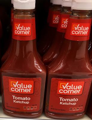
PANTRY ESSENTIALS IS NOW
VALUE CORNER >>>

Finishing up with some old news. Pantry Essentials was rebranded last Spring as Value Corner. Another HUGE improvement! I had been working on a post just for this topic but it never got finished. The news turned out to be a perfect addition to this post.


Huge improvements all around! I spent several years of my career in packaging design so I probably get a little more excited about these sorts of things than most people do. I really think the redesigns are a huge step forward for Acme and all the Alberstons banners.


I didn't know that about your years in packaging design! I'm not headed in that direction myself, but I really enjoy seeing these changes nonetheless. Some of the new Signature Select packages remind me of Kroger's similar redesigns of late. Eventually I'll do a post on that on my blog, but for now, here's an example I found: http://www.raecheldesena.com/kroger-breakfast
ReplyDeleteThere's a unique look for a lot of different categories, making the items stand out more. A lot like what you show in this post for Signature Select.
I like the new black tag logo, it looks less formal, more modern at the same time. It is sad that they cannot get ACME on the products again. but hey... i'll take better store branding over genericness
ReplyDeleteI also like the "Signature" branding. Not sure how I feel about extending "Open Nature" beyond food products. I also don't see the point in competing in the "Value" category; it's not a fight they can win.
ReplyDeleteIt is a safe bet bet that the Lucerne, Signature Care, and refreshe brands will not be eliminated by Albertsons
ReplyDeleteVery nice update to the packaging. The old look was pretty bad looking for store brand standards even. One new store brand look I love has been ahold's new look for giant, everything looks great so far.
ReplyDeleteAh, now the fruit bowl logo looks like a sticker slapped on the packages. The new packaging IS a big improvement! Interesting how the private labels are being added to packaging as stickers and tags.
Delete