Photos courtesy of catnapped
Location: 2007 State Route 35, Wall Township, NJ
Opened as Acme on November 6, 2015

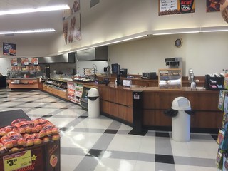
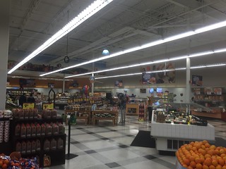
An extensive remodel is underway at the Wall Township store, one of A&P's original future stores! It's interesting to see what Acme is doing here considering A&P couldn't be bothered to do much of anything. The store had a very basic "fresh" update with nothing more than a décor swap. The aisle signs didn't even get replaced. Acme, however, is pulling out all the stops to transform this location into a real beauty!


A&P's coffee counter in the front corner has been removed. I belive it was mentioned in a comments section somewhere that a Starbucks is being installed here.

BEFORE...

Before photos courtesy of Dan Asnis' flickr collection

Have to say, I love the color scheme Acme is using in these remodels. The department signs look particularly good with the lights left over from A&P illuminating them from below. Such a huge improvement over the drab look of the A&P. New salad bar and hot foods bar have been installed. The flooring is being replaced in other areas of the store. I suspect it will be replaced here once all the new cases are installed.
BEFORE...

Acme painted over A&P's farm mural that ran along the wall above the Bakery.


And what's this? A room being built in the Produce department. Probably for fresh cut fruits and veggies but I can't say for sure.


Along back of the new Produce room.


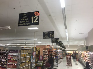
Aisle markers running parallel to the aisles just like the A&P signs previously.

Acme is removed the ugly, slotted panels that ran along top of the meat and dairy cases. Perhaps they're putting new one up as all the brackets are still there. You can catch a glimpse of them below...


Old tile meets new.

Acme replaced the center aisle of gondola frozen food cases with upright cases.

New tiling in one of the frozen food aisles.

MORE new cases going in!


"This Is Your ACME" is a great new addition to the remodeled stores! The retro logo wall seems to be getting the ax. We haven't seen it in any recent remodels.


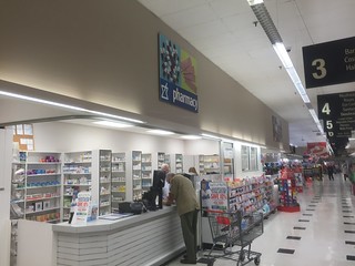
So it looks like Acme is moving the Pharmacy from the entrance side over to this corner from its original spot next to Customer Service...

So my question here is... what sign is under the brown paper? What is Acme putting in this area?
BEFORE...


All new, sleek tiling along the front-end.


BEFORE...


I'm really loving the simplicity of design Acme is using these remodels.


AERIAL VIEWS

Pathmark competed with A&P for decades until it closed in 2009.

Looks like the store was expanded on the right side.


HISTORIC VIEW


I think that the outside would look better if they had separate letters for A-C-M-E instead of reusing the A&P oval.
ReplyDeletePossible they might change them once they finish inside.
DeleteWhere would they put the letters? Reusing the sign is fine.
DeleteAh, the Futurestore. What a brief yet aesthetically great period in A&P store construction!
ReplyDeleteIf only Allendale kept its original styling. That might've been an awesome looking Acme. (Haven't been in there in years, well before the remodel.)
I see that A&P wasn't even bothered to swap out the Fresh Obsessed aisle markers for others, like it seemed all the fresh remodel packages did. I thought they were only in stores that got left behind the times like Garfield (Superfresh decor) and Bloomfield (old Food Market decor).
I hope they get rid of that old A&P pill sign as well and replace the sign with A C M E as well!
ReplyDeleteI LOVE Futurestores!!! they are so awesome, with the greenhouse-like front. I also like how the new futurestores like Ortley Beach are laid out the same as old Futurestores, like Wall.
ReplyDeleteMight be an interesting tribute if they'd have done the sign with the red background and white letters (as some of the Acme signs have been seen) - even better if they could sneak in the yellow & orange stripes at the end ;)
ReplyDeleteGotta say this store's interior looks pretty horrible. Kudos to Acme for stepping in and making some long, long overdue upgrades. I am sure the store will look fantastic once it is done. Hopefully someone can return after the grand reopening.
ReplyDeleteWe'll probably never see an Albertsons Cos. (any name) branded store under a Kroger Greenhouse (even if by some odd change of hands like Kroger -> independent -> repurchased), but A&P Futurestores are the next best thing. It's too bad A&P never had "real" Sav-a-Centers up north (not Pathmark SACs, those are not the same thing) like the New Orleans division, otherwise ACME could've picked up some massive (70k-100k square feet) stores.
ReplyDeleteYou're not counting the massive rebranding in the 80s, are you? Where it seemed like every single A&P (with very few exceptions) went green?
DeleteThis is my local store. Well, my local Acme, anyway. The area is rich in supermarkets- there's a new Whole Foods across the street, a forgettable Super Foodtown less than a mile away and an old ShopRite housed in a former Penn Fruit. Nearby Neptune has a great Stop N Shop and Ocean Township is home to my favorite, a gigantic Wegmans.
ReplyDeleteThis is a nice store. The grand aisle and the part that wraps around the back (leading into the new organics section) is all done in wood-look laminate flooring. Almost all of the flooring is new- it annoys me that Acme didn't spend just a little more money to replace the tiles in the aisles (they're all white- somewhat mismatched from years of repairs- and the frozen food aisle still has the black squares that now look out of place). Most of the store's cases are new. Produce moved to a new home in the far corner and the Starbucks is about to open. All registers are new. I've never seen so many flat screen TVs in a retail box not named Best Buy- they're all over the place. A lot of money as spent upgrading the place and overall it's a pleasant experience.
I've noticed that the great prices of last year are mostly gone- it's expensive shopping here. Many of the organic items are priced higher than in the Whole Foods across the street. Why introduce those items and make them more costly than the competition? At least there are always open registers (at least when we shop in the later evening hours) and finally (!) there are 24 hour grocery stores in NJ again. At least this one. Unlike ALL of the competition, this Acme is open 24 hours a day, seven days a week.
With better prices, this would be a great store.