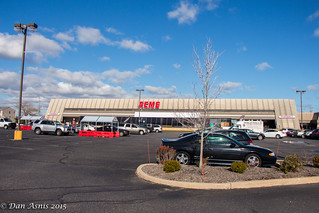
A&P's FUTURESTORE FACADE
IS A GONER!
IS A GONER!

Location: 5 Ortley Plaza, Ortley Beach, NJ
Just in from Dougbalt...
There's a remodel underway at the Ortley Beach location. They're ripping out the front, futuristic, slanted windows as well as the cashier area underneath and are doing something new. I can't tell yet what will become of it.
Turns out, he can...
Mystery solved: I asked an employee. She said they're installing a similar facade to the ones in Sea Isle and LBI.
Turns out, he can...
Mystery solved: I asked an employee. She said they're installing a similar facade to the ones in Sea Isle and LBI.
THIS JUST IN >>>

Doug got a picture for us!
P.S.: Check back tomorrow for another Quality Built store!

Thank God.
ReplyDeleteI know there is some sense of nostalgia for this A&P design element but in my eyes the slanted slab of dirty, faded concrete makes the store look like a Brutalist government structure.
Took the words right out of my mouth LOL. That concrete reminded me of one of those "tower block estates" in the UK....
DeleteI agree with Pigeon here, and am happy to see ACME investing in this store (seriously- when is the last time ACME redid any of their facades!?)However, I have always had a soft spot for the FutureStore. It's sad to see it go.
ReplyDeleteWhile it is sad that a unique facade like this is being destroyed, it was rather dated and just didn't age well.
ReplyDeleteThe Kroger Greenhouse stores (which inspired this design...the first Futurestore was a former Kroger) have aged well and can still hold up well today in some cases (even though too many of them have been destroyed)
Yeah, all they really needed to do was recenter the Acme signage, remove the A&P signage and give the building a good powerwashing.
DeleteI'm not sure a powerwashing would've done it. Like garish 1970s department store designs, the Futurestore décor just can't really translate over to acceptable design today. Perhaps what really sets Futurestore and Greenhouse apart is that the latter gets a pass since Kroger is still fine and well today, whereas here it's painfully obvious that ACME is wearing hand-me-down duds.
DeleteThe Wayne Futurestore looked fine. I don't know how much powerwashing might have helped Ortley Beach though. Don't forget the beach isn't that far away.
DeleteACME STYLE....That greenhouse design ... is that the design of Acme in New Canaan Ct?
ReplyDeleteI'm not sure what you're asking. The New Canaan store's greenhouse is similiar to the first round of A&P futurestores.
DeleteI echo all these comments, especially what Pigeon said. Although I haven't seen the data, I'm assuming this location did very heavy volume over this summer. It's the only supermarket on the peninsula. In fact, it's the only major store on the peninsula. There isn't even Walmart, Target, etc anywhere nearby. There are some very high income towns nearby, including Mantaloking, Seaside Park, and Lavallette. I thought it was pretty busy when I was just there (way after Labor Day). Acme is doing the right thing by investing in this location.
ReplyDeleteI am pissed!! that was in my opinion the best looking exterior in the chain!!! I have so many fond memories of the place and I won't even be able to recognize it now. this is terrible!!!
ReplyDeleteTimes change, the future stores looked neat for the era, but it isn't Acme's thing. They've always had a down to earth feel, like with the A-Frame Pitched Roof stores. Despite being "Modernist" in having everything exposed, it still provided a fairly grounded feel to the store. A&P was always chasing the future. Acme is trying to present a more laid back look to consumers, trying to be ultra inviting with the colors, the decor, even the signage. By turning this into a proper acme, you get a instant "hey, that's an acme" look to it as well. An acme should look like an acme.
ReplyDeleteI guess everyone will have to go up to Fishkill (NY) and see that one (which has been an Ocean State for a few years and knowing how much they (don't) renovate stores...)
ReplyDeleteare they recobfiguring and remodeling the interior as well?
ReplyDeleteHalf of the cashiers that were under the windows have been taken out, while they're installing the new facade. But otherwise the interior is unchanged since converting over the Acme last year. I'm assuming that some improvements were done after Sandy, so the interior is still in good shape.
DeleteThe store was remodeled after Sandy even though it didn't suffer any damage. I'd bet Quality Built will be going in, at the very least, once the facade nears completion.
Deletethey did remodel extensively after Sandy, and I don't know if they will remodel this time because it's so new, but a reconfiguration may happen because they cut off a bunch of the store with the front coming off. also do you have any more recent pictures of the construction/destruction?
Deleteon another note, do you think with all the extensive remodeling throughout the chain, they will ever finally remodel the Milltown store? it is in desperate need for one and I had hope a few years back when they did the reset.