

Location: 2497 Brunswick Avenue/Route 1, Lawrenceville, NJ

When we last saw the Lawrenceville store on the blog back in September 2014, the self-checkouts were being removed and rearranging had been underway in some departments. This was around the same time news broke that Acme had signed a new long-term lease here. The news was accompained by word that the landlord was going to make a huge investment into the shopping center. There's absolutely no sign of that ever happening. In fact, the center seems to have more vacancies than ever with the Acme the only store drawing any significant business. As mentioned in previous posts, there is intense competition on Route 1 including Wegmans, ShopRite, Whole Foods and Trader Joes all within close proximity to each other. The Acme happens to be just far enough south to enjoy a comfortable distance from the competitors. This is a surprisingly busy store especially considering its relatively small size.
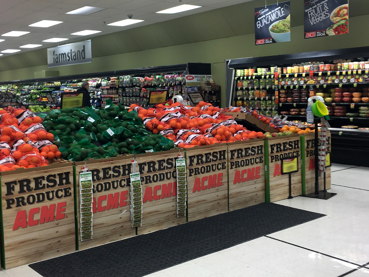
Ever since my visit in 2014, I've been planning to check back in to see if a remodel was in fact underway. Turns out it was! Sort of. This is one of those situations that I would call a refresh more that a remodel. Not a whole lot has changed beside the décor. That said, the store does look really good....

The Premium Fresh & Healthy version 3.0 décor has replaced the Chalkboard Market signage and color scheme.
BEFORE...

The coffin cake case was replaced with upright refrigerators for the Bakery with enough room remaining for some additional cases for Produce. The Bakery sign here used to hang over the service counter but was moutned to this wall in recent years. Too bad they didn't give this perfectly good sign to the Lincroft store to replace their wacky Bakery sign.

The product images and fresh messages that normally accompany the department signs were not included here. Perhaps they were cut since they would be a bit overkill with all the new "Acme loves local" signage.
BEFORE...


BEFORE...


BEFORE...


The service departments would look a million times better if the back walls were tiled. Particularly with Seafood, it seems like we're looking into the back room.

The frozen food cases were updated years ago.

All of the former green sections of the ceiling have been painted white...
BEFORE...


No department signage in the back section of Dairy, just a stunted aisle sign.
BEFORE...


As mentioned in the last visit to Lawrenceville, the last aisle has been removed to give some much needed breathing room for Dairy. The grocery selection must have taken a pretty big hit since this wasn't a very large store to begin with.


The front-end didn't get much love during the remodel. The old register lights are still in place with some just about to fall over. The self-checkouts were located in this spot.
When was this even remodeled? Right now, (similar in many ways to Albertsons Inc.), there's at least five completely different remodel packages being pushed around right now not including the United packages: Lifestyle v1 (a Vons reopened yesterday with it!), Lifestyle 2, "Quality Built" (LLC, not counting the variants within), PF&H 3, and a new package for the remodeled Albertsons/Safeway stores in Florida. What a wacky grocery chain! I guess that's one reason some of us love it. :)
ReplyDeleteI'm assuming late 2014 since changes were underway in September but who knows. It took more than 6 months for a minor reset and refresh to play out at the Milltown store.
DeleteHell yeah it did. It took them SO long just to put the aisle markers back up. I couldn't find anything after they switched the entire store around and before the markers were replaced.
DeleteHey, PseudoSD, where is this VONS that re-opened with Lifestyle v1? That package was replaced years ago. I would love to see that store. Is it one that was Haggenized and has since been brought back into the fold?
DeleteThere is an additional decor package. Jewel has a package with some elements of "Quality Built" (mainly the historical photos...love those white porcelain tiled stores) that uses cursive on department signs, a slightly different color scheme, and the same aisle and register markers. Interestingly, The Quality Built register markers started popping up in some Premium Fresh and Healthy stores around the time Albertsons LLC bought the chain. My guess is Albertsons modified Quality Built as a reaction to the Mariano's stores. If that's the case, it shows Alberstons is thinking. Will be interesting to see what happens to Alberstons stores in markets where they compete with Kroger now that Kroger owns Mariano's and starts implementing elements of that chain in its stores. For grocery enthusiasts, shopping at a Mariano's is worth a trip to Chicago.
Maybe grocery shopping will be fun again. :)
I remember when I was in high school this store had the 80's decor package. A few of my friends worked here!
ReplyDeleteLooks good! Will be interesting to see which package Newtown gets remodeled with, seeing as how it also has the Chalkboard decor.
ReplyDeleteNewtown had a major remodel in 2012. PF&H 3.0 with some rearranging of the departments.
DeleteAh okay, I took notice of the aisle markers but haven't shopped there long enough to know about the rest (and haven't studied the decor directory well enough!).
DeleteI know last time 'ya announced Acme's remodel list for 2016 Newtown was on it, but that might just be for the beer department going in now that I think about it.
Yeah and the planned "remodels" Acme has been announcing haven't proven to be TRUE remodels.
DeleteGotcha, thanks for the insight!
DeleteIs it just me, or is PF&H 3 kind of the new version of Neighborhood Market or Convenience Store? It seems to be the cheaper decor going into lower-end stores in need of remodel, while Quality Built goes into higher-end stores, like Chalkboard Market (ironically in this case) in the late 90s when Convenience Store and Neighborhood Market were the lower-end versions (if I have the timeline right...)
ReplyDeleteIt is true that the PF&H v3 is a basic remodel package going into lower end stores but the Convenience store package was even MORE basic. It entailed nothing more that painting the walls and putting up the new red and blue décor. If a store got new aisle markers, they were hand-me-downs from a 90's Red/White/Blue store. Rarely would any cases be replaced or any other upgrades be done.
DeleteApparently, new owners are going to make Acme look pretty spiffy on the outside, at last.
ReplyDeletehttp://lawrencesc.com/img/gallery/fullsize/1.jpg
http://lawrencesc.com/