

Location: 71 Taylor Ave, Manasquan, NJ

The Manasquan Acme is no longer the classic it used to. The fish-eye sign outside has finally been updated and all signs of the Checkerboard Arch decor inside have been completely removed. That all said, the remodel completed a few months ago is a stunning success! While the changes made to the interior are not as extensive as they are in a typical remodel, the store has been beautifully transformed from its former self.

First a look around outside. Interesting cart storage situation at this Acme. Carts are lined up in the parking lot with the very first cart up against a freestanding gate. There are no railings along the sides as you can see above. The store does have enclosed cart corrals (as seen above) for shoppers to return carts to. The line of carts in this photo appears to be cart storage for shoppers just arriving at the store. During the summer months, there is no room on the sidewalk for cart storage as this location keeps the area fully stocked with seasonal merchandise.

As noted in previous posts, paint has been removed from the lower portions of the first 3 windows from the entrance. Shelving just inside the store has been removed allowing the store to feel more open. The recent remodel brought a much needed streamlining of merchandise that lined the interior front wall.


Heading inside...

I believe this painting just inside the entrance is relatively new. I don't recall seeing it in previous visits. A beach scene extends all the way to the left side. I thought the picture I took was a bust until I got it downloaded on my computer and saw that it turned out great! Notice "ACME" is painted with the font from the former fish-eye sign.

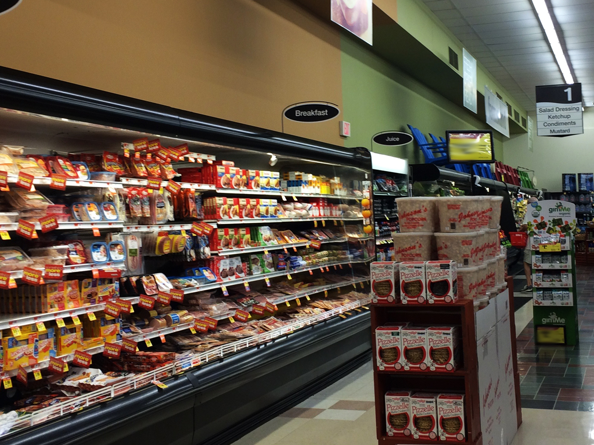
Yes, the produce floor is still here! The flooring throughout the store was the one thing left untouched during the remodel. It is in surprising decent shape. Extra shinny too since the remodel. There are some areas that could go for new flooring but considering how great everything else looks, it's not terribly noticable.

This faux slate flooring is one of the best elements Acme has ever had in it's stores. More of this produce flooring to come once Acme Style hits 300,000 visitors. Interesting how it extends to the wall in certain areas and not others. This store opened on June 28, 1968 so this floor would have been installed during the 70's Colonial Decor remodel.

New black shelving has been installed along the front wall. So much classier and streamlined than what used to be here. Now look a little higher... what do you see? A brand-new ceiling! Not sure if Acme has been reading this blog and noting my criticism of leaving the ceiling a mess when they do a remodel. Probably not, but they are now fixing up the drop ceilings! This has happened in other recent remodels as well which we will see in the coming weeks. Looks as though all of the tiles in this store have been replaced. The ceiling is absolute perfection now. They have also replaced all of the tube light bulbs brighting the store and creating a bright, cohesive level of lighting throughout which does this small store a huge favor. You'll be seeing more of the fresh new ceiling below.

The produce cases that were here on my first visit were black as well although I'm quite sure these are all brand-new. If not, they're been fixed up to look as though they are.

The Produce Department could not be looking any better here. As I seem to keep mentioning, the store has been drastically streamlined compared to how it used to be.
They're keeping less merchandise along the top of the cases these days. Really cuts down on all the clutter that used to plague this Acme.

The "Lunchmeat" cases have been restored! I found these cases half filled with bottled drinks the first time I was here You can catch a glimpse of that by clicking here. Unfortunately the photos from the original post don't show much of the cases in the store. In the earlier days of the blog, I focused on taking pictures of just the wall decor and left out as much of the merchandise as possible. Of course the blog has evolved a lot since then and I was realizing that we were missing out on the full-store experience with such limited photos.

It blows my mind how these tiles are in near perfect condition.

Some views of the ceiling and lighting...

A note about the selection here... checkout the variety of "natural" and gourmet salad dressings. Pretty substantial for a small, 10 aisle store. I noticed an impressive selection in numerous categories around the store and can't help but wonder if the added variety has been brought in by Albertsons. SuperValu was notorious for removing SKU's from stores. They would release statements saying things like "we're reducing redundancy of package sizes". Yeah right. They were just trying to save a buck by having to deal with less merchandise. It proved to be a disaster and they wound up having to back track slightly on this grand plan. But let's face it... anything they could do to drive customers away, they'd do it!

Creative tile replacement on the right.

The original spot lights remain under the Deli awning. How much better would the Deli look with a tiled wall like the Bryn Mawr store has? Click here for a look. Guess it's good that I'm not the one making these decisions. I would definitely be out of a job for always being over budget on remodels.

I swear a lot of the aisles in this store are taller than they used to. They're all stocked extremely well.

Some mismatched tiles along the back. They stripped and shined the floors so thoroughly that the imperfections are not very noticeable.


Some aisle markers didn't get a full list of aisle contents. See 6 and 7 and later 8.


No "lancaster brand" signage here.


For a look at this area in the original post, please click here.

It looks like the frozen food cases were just painted along the bottom with new bumpers put on.


Ceiling fans have been added above the last aisle.

As with Produce, the Dairy cases look brand-new.


It looks as though the aisles were retiled at some point. The aisle tiles are in better shape than those in the permitter of the store.


The former bread delivery room is now office space. The "Bakery" used to be along the wall here but was relocated years ago to extend the dairy cases.

No "at your service" sign above Customer Service.


Overheard an interesting conversation at the checkouts when I was photographing the front-end. A cashier had just finished bagging a customer's gigantic order. So big, they were having a hard time getting all of the bags into her cart without them overflowing onto the floor. Certainly an odd sight in a store like this were people are just grabbing a few things and getting out. The next customer online had asked a question which I didn't hear but must have went something like... "Do you do your weekly shopping here?" The woman who was still trying to fit her haul in the cart said "I love shopping here. Those big stores are too stressful." The second customer then remarked about the produce being nicer at those "big stores" to which the first customer said "I like the produce here and the employees are all really nice." Surprisingly too as this woman was a young, soccer mom type. Not an older person more used to shopping in a grocery store of this size.

Yep, the clock has been removed! Click here for a look at it in its former glory.

Interesting tile greets you just through the entrance. No idea if this is original to the store or added swapped in later. Notice too, only one set of doors! There isn't a second set once at the interior side of the vestibule. Must be cold for the cashiers in the winter!

Great to see this classic store get such a successful remodel! For coverage Manasquan's past, please click here. (Scroll down past this post when you make the jump)
The entranceway tile is probably original to the store as it is next to the grating for the air door system. You can see the upper portion of the air door vent in the prior picture. The Point Pleasant Acme had that same tile and floor vent only in the former entranceway (at southwest corner of the store front) which was bricked up and turned into a janitor storage room when the store was reconfigured in 1978-1979 time period.
ReplyDeleteLew
From the pictures, the white front wall of the store seems kind of plain. Might of looked better if it was green.
ReplyDeleteIt looks very good, and I'm so glad that they left the 70s-era produce flooring intact.
ReplyDeleteWhile on the subject of Jersey Shore Acmes, I hope that the Sea Isle City store still has the old 70s-era and 90s-era department signage.
This store look fantastic! I'm curious as to why they did that sloppy paint job in the first place to the old decor. I'm still upset the fish-eye disappeared from out front, but allover the new sign looks good. Glad to see Acme investing in the older small stores.
ReplyDeleteThe reason why the Lancaster name isn't there is because this was an off the shelf PF&H design that Albertsons used (and not a SuperValu remodel).
ReplyDeleteGreat store! So, we get two new Acme's this summer! (I think of this one as new, because it looks completely different). Very nice, although I am sad about the fish-eye logo leaving. Maybe we can spot it around back?
ReplyDeleteOhhh... there's another *new* Acme coming to the blog in a few weeks that looks completely different.
DeleteThere is an area of tile which is similar in color to the floor tile near the exit, above the customer service area, on a slanting wall, below the drop-ceiling. Any idea what this area used to be or what this tile is left over from?
ReplyDeleteI love the meeting of all the styles at the courtesy counter--the brick (I think it is real exposed brick) with the yellow and blues of the walls, that small strip of beige tile and then the drab beige wall forming the back of the courtesy counter (I guess the counting room back there). It makes for a very cool look.
Yeah, that tile is pretty strange behind the office. Looks like floor linoleum on the wall rather than tile. Perhaps it was a cheap fix for a deteriorating wall at some point.
Delete