

Location: 4454 Black Horse Pike, Mays Landing NJ
Right off the bat we see something interesting here at the Mays Landing store. The red-oval logo sign outline still makes it's presence known just above the the block letter signage. The store started out with a unique treatment when it first opened. The oval shape was built into the facade with letters mounted on to it. In the 90's the oval was painted white with the current logo's red letters mounted to it. You can see an image of that era here. That signage was eventually removed with the whole front section being painted white. A larger version of the block letter logo along with the Sav-on sign was mounted to the facade . That treatment can be seen below. Recently, the store front was given the Premium Fresh and Healthy exterior upgrade. The white section having been recovered, further disguising the oval shape. You can see that the oval now bulges through the surface rather than being an outline on the facade. This area was painted beige with the red letters switched out for white. The Sav-on sign was surprisingly downsized and bumped over to the right awning area. The red delicious apple window covers were also added making for the store's best look yet!

The above photo is from iirraa's Photostream on flickr

Mays Landing is very similar to the Cape May North location. Both stores were probably built around the same time. The format here was new to Acme. The late 80's/early 90's stores saw a huge increase in square footage from it's early 80's models and saw the debut of a new layout as well. Acme would go on to build larger stores in the 90's but maintained this new layout throughout the decade. (Graphics of the layouts throughout the decades are coming soon to Acme Style.) Mays Landing undoubtedly started with the 80's decor. That decor may have remained in place until it was swapped out for the "Industrial Circus" decor package....

First shot's a blurry one but the rest are all good.

Can you spot the mistake here? Someone wasn't reading the directions when they installed the department signage here. The panel with the fruit graphics was tilted too far! It's should only have a slight tilt. Check out this photo for the proper, more commonly seen angle. Now you might say "who cares?" Well the other departments around the store care cause that bottom orange square wound up taking a beating from passing hand trucks.

The older version of he "Wild Harvest" signage still hanging. Funny too see a huge Tastykake display right under a "Natural Foods" sign. The first aisle looks to have been removed at some point to open up this area of the store. Shelving may have been removed during the "Industrial Circus" remodel to help create this "grand aisle" which gives shoppers entering the store a better look at the fresh offerings and service departments to the rear of the store. The last aisle also appears to have been removed creating a very wide Dairy department which allows for ample displays to be set up.

The Alberstons quality logo hanging from the awnings. I know this is not a favorite decor package among Acme fans. Often hear it being described as just plain "ugly". I still love it. The more Acmes I get to, the more I realize that Albertsons kicked off a huge remodeling program when they purchased the company. American Stores had debuted the "Chalkboard Market" remodel a few years before the company was sold. That package didn't spread very far throughout the chain. This remodel certainly did. Guess Albertsons did invest quite a bit in improving the stores.
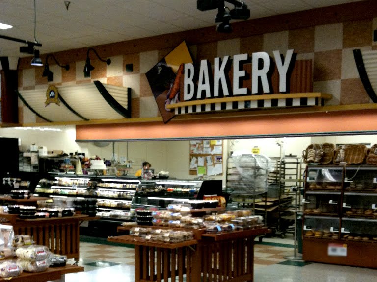


Square panels installed correctly in the service departments.

The Meat and Seafood sign could use a little light. The cases are set up beautifully here.

Orange square hacked off. Probably damaged at some point. The one in Dairy is still intact but is damaged. The ceiling here is slightly lower here than in other 90's era Acmes.

Premium Fresh and Health aisle markers in place.

And now for a quick look at the debut of the "Essential Everyday" brand which is replacing Acme branded products. Cereal and pasta products are the first categories to be changed out.

The new packaging is quite nice but, in my opinion, it's a little too inspired by Publix's store branded products. You can see a little more discussion on that by clicking here.


Could have sworn I took a picture of the side with the damaged square... but I apparently didn't.

Pharmacy is in it's usual spot here with greeting cards just behind me in the front corner. Floral is an odd location at this store. It's a free standing department over at the Produce side entrance. First thing you see when you walk into the store.
Up to the aerials...


Mays Landing looks to be doing well these days despite the competition in the area. Walmart is located very close by as is a Target. Both stores are sized in the smaller range compared to other stores in their respective chains. And guess what? There's a ShopRite less than 2 1/2 miles east on Black Horse Pike! Although that too looks to be smaller than most other stores in the chain. Acme's proximity to the mall must certainly be a help. Navigating through this area on a summer Saturday is not the easiest of tasks. Black Horse Pike was bumper to bumper leading to the Atlantic City Expressway and the Garden State Parkway. Some serious shore traffic coming through these parts.
Only a few historical aerial views...

2006

2002

1995

1970


Mays Landing is not quite a shore town but the Acme most certainly picks up some serious business from shore goers passing by.
My dad's company was assigned to build a port in paulsboro, NJ. once I came there with him, and I happened to notice an old pitched-roof store that I think was an acme until it closed.
ReplyDeleteIt was an Acme. It's been photographed and will appear on Acme Style by year's end.
ReplyDeleteAccording to Loopnet, this location was built in 1990.
ReplyDeleteI have shopped here many times. It's a nice store. Used to be open 24/7 until a few years ago.
I just stopped at this store on my way home from Atlantic City ... seems like a nice store with friendly employees ...
ReplyDeleteI could just go off on a tirade about losing the Acme store brand. Yes, I realize that the Acme brand is not what it used to be but I still liked buying them, at least for old time sake. To me, Everyday Essentials sounds like a brand of a tampon. Supervalu is now taking any last hint of individuality out of its stores and replacing it with some generic brand. It's just like what A&P did with their 'America's Choice' brand. It seriously was one of the reasons I stopped going to Super Fresh. So gone are store brands like Jewel, Shaw's and Albertson's. Why even keep the Acme name on the stores? (That's probably an upcoming discussion.) Acme last hope for survival is that its customers are based on traditions. Acme's prices are too high. Acme's stores (tend) to be smaller. They're easy to maneuver. They are geared to an older customer base who is loyal to their local store. They are hardly the destination stores that others have become. (I was in the Ocean City Acme last night right before the store was to close for the hurricane and it was as dead as a doorknob.) Take away the name and your remaining base will go away. Once the Everyday Essentials tampon name fully replaces the Acme store brand I'm done. Seriously. Unless I need some Lancaster Brand hot dogs or Ivins' Spiced Wafers. But Supervalu is probably too dumb and desperate and will drop those also. Please realize that nobody is more of an Acme fan that myself and this blog nicely shows that Acme fans can exist.
ReplyDelete