Tuesday, March 29, 2011

Acme's cousin... Star Market


Photos of the Wellesley Star Market courtesy of The Swellesley Report

Location: 448 Washington Street, Wellesley MA

Well, not quite cousins, but the two chains have shared several connections over the years. Star Market got it's start in 1918 in Watertown, Massachusetts. By the 1940's the chain had grown a significant presence in the Boston area with modern conveniences not yet found at it's competitors. In 1964 Star Markets merged with the Jewel Tea Company which was eventually acquired by American Stores in 1984. Acme and Star Market remained under the same corporate umbrella until 1994 when Star Markets was sold to Investcorp, severing the ties between the two companies. In 1999, Star Markets joined up with Shaw's which began to phase out the banner.  In 2004, Shaw's and Star Markets were acquired by by Albertsons, reuniting Acme and Star Markets within the same company. In 2006, SuperValu acquired all the companies above. (Thanks to Wikipedia for being the only source on the web to tell the convoluted story of Star Markets.) 

Interesting to note as well, Wild Harvest foods got it start at Star Markets. Albertsons rolled out the brand to it's banners, including Acme, in the early 2000's. 

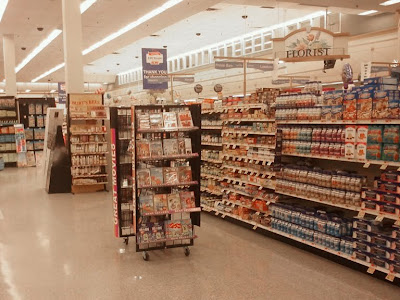
Take a look at the interior of the Wellesley Star Market. Look familiar? It's a slightly modified version of the Checkerboard Arch decor package used in Acme back in the early 90's. Here, the checkerboard is limited to the back wall of the service departments. I came across these pictures of the Wellesley store on The Swellesley Report as I was researching Star Markets a few months ago. I knew the two chains had a connection but was surprised to see how closely they were related. 

Service departments here were done with the cursive font. Most Acmes had only the Bakery department done in cursive with the rest of the store done in block letters. Here you can see the flooring that would have gone into Acme stores with this package. Acme opted to leave the relatively new 80's checkerboard pattern in place in remodeled stores. (Manasquan went so far as to keep it's 70's floor when it received this remodel.) You can tour Acme's Checkerboard Arch decor by clicking here.

Oddly shaped building. The darker roof section out on Washington Street was a Chinese restaurant that has since vacated the property. This location if currnetly undergoing an expansion and is being transformed into a Whole Foods. 

This image was sent in way back when I first started the blog. It came in from an Acme fan who has been supplying us with some very interesting images over the past 2 years. How about that logo... the Acme's oval with the old Star logo inside. Clearly from back in the days of American Stores running Star Markets. 

The most recent Star Market logo. Shares the same font and similar design with Shaws logo

The two stores pictured below were among the locations in the Boston area to be rebranded "Star Market" after the conversion to Shaw's proved to be less than successful....

Location: 1065 Commonwealth Ave, Boston MA

Tough to see here but the Star Market logo is on the upper left hand corner of the center building. The building take up the whole block with the parking lot across the street. 

Location: 370 Western Ave, Brighton MA

The Brighton store shows up on Google Maps as a Shaws. The switch back to Star took place in 2008. 

Location: 275 Beacon Street, Somerville MA

I believe this to a rare sight... a Star Market still in bussiness with the old logo on front. It's hard tracking down exactly how many Star Markets exist today. Appears the number is in the 10 to 20 range. Would have been less if Shaws hadn't reverted some of their stores back to the their Star Market origins.

First I should mention, looks like Google Maps is going hi-def! I've never seen a street view this sharp. I would use them more often but it always looks like Google takes pictures through a dirty window. The street view also shows the store in better shape than the aerial image above.

Location: 61 Locust Street, Medford MA

Check this out... looks just like an Acme from the 90's! This location was originally a brand new Star Markets but has since been rebranded as Shaws. Click here to see a model of the store prior to it being built. The image is included on the portfolio page of the Patterson Architects, Inc website.

Not a lot of cars at Shaw's. A brand new Stop and Shop just a few blocks away appears to draw much bigger crowds. 

Star Markets branded trailer at the back of the store. 

Additional Star Market pictures: 

• Check out the brand-new Star Market of Chestnut Hill!

• The abandoned Star Market in Somerville, MA. 

• Interior shot of the Somerville Star Market

Friday, March 25, 2011

Rare Decor — Acme, Hamiliton Square NJ


Location: 953 Route 33, Hamilton Square/Trenton NJ

A classic 90's Acme from the outside with a rare decor on the inside. Don't let the white signage fool you... this store has not received the Premium Fresh and Healthy remodel. I'd love to know the thinking that goes into which 90's stores get white lettering and which keep the red. The Woodbury store, who's exterior is identical to this store, still has the red lettering on the outside but has the PF&H remodel on the inside. This store may have received recent upgrades that would put it in the PF&H class of stores but the decor, which has yet to be featured on the blog, has not changed since the early 2000's.

Pictures of the Hamilton Square were provided by Mike S. He has confirmed that this store started with the 90's red/white/blue package. It's current decor is one I have seen it in a few pictures but haven't been able to get to one of these stores myself. It must only made it into a handful of Acmes before another interior package was rolled out. Let's take a look inside...

One of the first things you'll notice... the lack of department signage on the walls. Instead, the department names are mounted or pictured on structures that hang from the ceiling. We'll be seeing some examples below. Notice here too that the windows in Produce are still oped to the outside. Many 90's stores now have them covered over with mirrors. Some extensively remodeled 90's stores have had the Deli department relocated to this area with Produce running along the first aisle. 

The picture above and below show the department signage with illustrated images. Others include the department name. The sign below also appears to have had the decorative ribbons removed from the front side... you can see the left over glue spots. We'll be touring another store at the end of this post which has the same type of signage but does have the department names mounted to each side. 

A unique aspects of this decor are the blue and green awnings above the service departments throughout the store...

Some of you may have seen the comment left by Matt following the Centreville store post where he mentions this decor package. (He also provided a link to additional pictures which you'll see below). Matt calls this package the "Awnings Decor", which I'll gladly go with.

Something not often seen... the 90's floor has been replaced. Unlike the bold 80's checkerboard floor, the 90's stores received a more neutral pattern that remains in most stores which have since been remodeled. For an example of the 90's floor, click here for a look at the dairy aisle at the now closed Cinnaminson store.  

"Quality Meats" making it's triumphant return! 

We'll be reviewing evidence that this decor package originated with Alberstons. Perhaps it was rolled out prior to the Industrial Circus package which did make it's way into large number of stores. Based on the pictures I have seen, I am fully prepared to call the "Awnings" decor package a winner. 

"Florist" is one of the clearly labeled departments in the store.

Small "Savon" sign haning from the ceiling. I particularly like the quilted pattern and crown molding around the entire permitter.  

Back out and above...

The strip mall to the left was a later addition to this shopping center. The Acme originally stood alone here. 

I almost feel like there should be a moat and a wooden drawbridge, right? This 90's model looks like a castle. All the brick... the arches... the huge ominous towers. A far leap from the quaint, colonial cottage model of the late 60's. 

Pharmacy drive-up window added sometime after 2002. 


Through the years...

2006

2002
Drive up Pharmacy has yet to arrive. 

1995

1979


Located about 1 mile west on Route 33 is the former Mercerville Acme which opened in 1956. I'm not sure which building was the Acme. At first glance, the building all the way to the left looks the most Acme-like from the front but not from the back. The building all the way to the right currently houses the "Hamilton Farm" farmer's market which, according to information online, is located in a former grocery store. The building has clearly been expanded over the years. The older portion would be about the size of a 50's Acme. I'll stop wondering about it all now as someone will certainly post an answer for us in the comments section.

Update 3.25.11: Well that didn't take long... first comment in has informed us that the Acme was the building on the left while SuperFresh occupied the building on the right. Here's a look of the shopping center over the past 50 years...

2002

1995

1979

1970

1963

1957

1953

More "Awnings" Decor Pictures...

After sold to Khourys
The following pictures are from StoreWest's collection on Photobucket and are being posted here thanks to the many photo sharing options offered by the website. And thanks to Matt for providing the link to the collection in his comments following last Friday's Centreville post. Matt also informed us that this decor is used in the Pennypack store in Philadelphia which is located on Roosevelt Boulevard. I passed by that store when I visited the former Adams Ave Acme. Kicking myself now for not stopping but as I said before, it was late and Roosevelt Blvd is a nightmare. Had to call an end to that road trip and head home.

After sold to Khourys
StoreWest's collection indicates that this is a former Albertsons store which was taken over by Khoury's which opted to keep the decor.

After sold to Khourys
This store was most certainly built with this decor package and is a bit more deluxe than Hamilton Square particularly with the style of the crown molding.

After sold to Khourys

After sold to Khourys

After sold to Khourys

After sold to Khourys

After sold to Khourys

After sold to Khourys

After sold to Khourys
StoreWest has a very extensive collection on Photobucket that is well worth checking out. Lots of interior shots of classic supermarkets.