Thursday, April 22, 2010

Grand Re-Opening, Union City Acme in 1977!


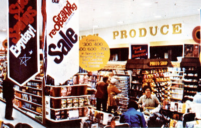
Finally... an old Acme ad! I have been wishing for one to turn up for a long time now. Thanks to Jim Koeppe... the former Grocery Manager of the long gone Union City Acme... for scanning this and sending it in. I am thrilled to be able to share this all at Acme Style. We'll be meeting Jim down below... he is IN the ad!

But before we go further I have to share another wish that I had on my list... finding out where the Union City Acme was located. I knew there was one on Kennedy Blvd but couldn't pin down the exact building. There were a couple that could have fit the bill. Thanks to Jim for getting it all straightened once and for all. When you see pictures of the building you'll wonder how I could have not been sold on it being the former Acme. It even has a crazy huge sign in the parking lot to this very day.

Not only do I know where the Union City Acme was... I now know that it had it's Grand Re-Opening back in 1977! Remodels in those days were not as extensive as they are now but exciting nonetheless. Acme was on a huge remodel kick in the 70's as it rolled out the 70's Colonial Decor to stores built in the 50's and 60's. Most of the efforts were to improve the appearance of the stores rather than store-wide upgrades of cases and service departments.

Dollar General moved in just recently. The front section was a Hollywood Video for many years. The awning was all done up with graphics and neon lights when it was the video store... which I think helped to throw my Acme detection sensors off course. Now that it's a plain Dollar General, I can sense the Acme vibe more easily.

I know, I know... this sign should have been the dead giveaway. But I haven't really seen an Acme sign quite like this one. They're usually taller and not partitioned like this one.


The entrance to the Dollar General is exactly where the entrance was to the Acme.

Jim climbed that sign many times to change light bulbs!

What it lacked in width it certainly made up for in length. The store was about 12,000 square with a full basement which housed the stockroom, breakroom and employee bathrooms. The boiler and compressors were also located in the basement. This rectangle shaped store was a popular choice for Acme in Philly and other
urban areas.


Check out the Grand Re-Opening specials...


Do to a bit of an unfortunate mishap the night before... the Acme salami had to be replaced with a ShopRite salami from down the street. The winner was none the wiser.


Plants were big in the 70's and they were a big part of the remodel! In the 80's Acme became famous for their 1/2 price plant sales. They would fill their stores with hundreds of plants which would sell out completely within a few days.

There's Jim!
Jim tells me the Acme was doing about $70,000 a week. Not that great even for the 70's. The ShopRite about 8 blocks down the street was doing a million a week. It has since been torn down and rebuilt from the ground up. 30 years later Acme still can't figure out how to compete against ShopRite let alone survive near one. Back in the early 2000's when Acme went on a North Jersey building spree, they selected a location in Union City which would have marked the company's return about 20 years after the original Acme closed. Acme was eventually denied the permits to build due to environmental concerns. That was probably for the best. I doubt Acme would have survived. Even the A&P gave up and became a Food Basics when the rebuilt ShopRite opened.

I created this graphic based on a sketch Jim kindly sent in so we could see how the store was laid out. I was very surprised to see 8 aisles. Acmes much wider than this had only 8 aisles. This layout was standard issue in Acmes of the 50's and 60's. Check out the conveyer belt in aisle 6! Cases were sent up from the basement for restocking the shelves. This conveyor system was moved to the Produce backroom during the '77 remodel.

The basement served as the stockroom. All merchandise was loaded into a small opening in side of the store. So small that some large cases couldn't even fit! The boxes would move down a conveyor belt to the basement which had a roller system throughout. Merchandise was moved along the rollers to specific areas for storage... only to wait for a ride back up to the sales floor. Wow... sounds like alot of work!

Jim's mom confirmed for us that the Acme opened in 1956. The property was a florist with huge green houses prior to the Acme taking over the land. The store closed in the early 80's... just a few years after the remodel. Even for it's time the store was on the small side and like so many other Acmes... suffered neglect from the company.

Much thanks to Jim for sharing his ad and all of the information he provided for this post!

Former Acme, Union NJ


Union Acme images courtesy of Rob Ascough


To clear up any confusion, I am adding the former Union Acme under the Union City post. This store was located on Magie Avenue in Union New Jersey which is about 20 miles southwest of Union City. Interestingly, it appears that both locations had nearly identical buildings. The Union Acme opened in 1957 and closed in October 2006 on the same day the brand new Freehold and Marlboro stores bit the dust.

The Union store clearly benefited from being in a densely populated area. Business must have been pretty decent here to have lasted so long. With only 6 aisles, it has to be one of the smallest Acmes to survive well into the 2000's. Albertsons pulled the plug almost immediately on all small stores when they took over in 1998. Union had another Acme as well about 3 miles away. That store closed in the late 70's and is now a ShopRite. There's a picture of that store down below.


I did lots of screen grabs long ago in case they got replaced when a new store opened in the location. That has indeed happened. It is now... surprise surprise... a CVS. Some satellite images show the store as a CVS which you will see down below. Until Rob came along with his incredible collection of old Acmes, I was planning to rely on satellite photos exclusively for the Union Acme post. I try to avoid using only satellite pics but in some instances they are the only available images of former Acme stores. And they're certainly better than nothin'!

A little Photoshop magic reveals the exterior signage of the store on this satellite image. (I did this before Rob reminded me he had sent in pictures of the store as an Acme.) The interior had the Checkerboard Arch decor. Not sure if it had the 80's remodel or if it went straight from 70's Colonial to the Checkerboard look. I regret never getting to this store... I knew there was an Acme in Union but had no idea that it was a classic. Check out the colonial window frames on the front of the store. You can see these on the former Parsippany store and the still-open Manasquan store.

The entrance and exit were along the front wall to the right side. The overhangs on either side may have been used for cart corals or may have been the original entrances and exits.


There must be a basement in this store but it's hard to verify from these satellite shots.

This shot clearly the columns along the side wall... a distinct trait in Acmes built from the 50's all the way through to the 70's.

Google Earth captured the building's conversion into a CVS.

Conversion complete! The was a tricky screen grab to get on Bing Maps. When I would move the building into the center of the screen the image would update revealing the old Acme.

As we all know... CVS loves a good old fashioned Acme. They put alot of work into updating these old stores but it must be more cost effective than building a new store from the ground up. Plus these old Acmes have ideal locations for drug stores.

This is the other former Acme of Union New Jersey. Closed in the late 70's. Now a ridiculously successful ShopRite. To be filed under "Acme Missed Opportunity" #287.

Wednesday, April 21, 2010

Decor posts are done!


You can jump directory to the decor posts by clicking Decor Directory in the Directory list on the right side of the page. These posts will continue to evolve over time as more pictures become available. A couple of the decor posts already need some updating with additional information but I am going to hold off until I can post more pictures as well. I need to do a couple of reshoots to replace bad cell phone pictures that I took long ago. Thanks for all the comments and enthusiasm for the decor posts! I thought I would be doing them more for my own entertainment but they have proven to be the biggest draw yet at Acme Style!

Regular posts resume tomorrow. I should have one up by Thursday evening... and it's gonna be a good one!

Saturday, April 10, 2010

Wednesday, April 7, 2010

Decor Directory!

Below are summaries of all decor packages
used in Acme stores from the 60's
through present day…

Tuesday, April 6, 2010

60's Fish-eye Decor


Classic image courtesy of Michael Lisicky

The 1960's saw Acme focusing more on the look and design of their interiors. Previous decor packages consisted mostly of simple lettering above the departments. There is also very little photographic evidence to document the evolution of Acme's interiors prior to the 60's. Even for this package, we have only two pictures that give us a look inside. The photo above if from the Clayton store. As you can see, the figh-eye sign that we're all very used to seeing on the outside of the stores was also used on the inside. Below if a photo from the original Lincroft store. If you look closely, you can see the fish-eye signs along the back wall...


Classic image courtesy of Patrick Richardson

70's Colonial Decor

Somers Point store photos courtesy of Michael Lisicky

This decor package began in the 60's and was used until the mid 80's. As you can see in the photo above the package didn't start out with a lot of colonial flare. It really hit it's full stride in the 70's and was the standard decor for nearly all Acme stores during that decade. The decor was officially retired when the 80's remodel swept through most of the chain. Some stores were passed over for remodels and kept this decor until the late 90's. 

The Produce Department flooring. Introduced well into the 70's when this decor package became more deluxe for newer stores and some remodeled stores.

The 70's lettering still in place over the Deli at the Sea Isle City store! The store has been remodeled with what looks like bits and pieces of several different decor packages... some of which were probably brought in from stores that closed. Thankfully they left the old Deli sign in place!

The Meat Department signage was virtually the same in every Acme throughout this era.


The abandoned Brown Mills store still has remnants of the Colonial decor. The walls were painted beige at some point with the signs left above each department. When the letters were removed, the original wall colors were revealed. 


The fish-eye logo which was used from the early 60's all the way through to 1986. This sign remained on many stores well into the 90's. The store in Manasquan, New Jersey is the very last stores to still have the world's most awesome supermarket sign!

Some great pictures from the American Stores 1978 Annual Report showing off the very deluxe version of the 70's Colonial Decor package...


The lamps on the wall were a big feature to the deluxe version of this decor package. They were not actually wired to anything so they were never lit.

I do hope to track down a photo of the Bakery wall paper. It was very 70's with a brown and gold foil pattern. Still holding out hope that will get to see it again someday!

Monday, April 5, 2010

80's Remodel


The 80's Remodel. Debuted around 1986. Acme's first new decor package in nearly 20 years swept through nearly the entire chain by the late 80's. With the new decor came several additional service departments that were generally not yet available in most stores.
They included...

Expanded Floral with refrigerated cases
Salad Bar
Cheese from Around the World
Full Service Seafood
Hot Foods
In-Store Bakery
West Coast Video Rentals
Stores received all new cases throughout
And... the systematic removal of Customer Service desks/counters in favor of the ill-conceived CSR stand. Also referred to as the "California front end". Went over about as well as a California earthquake.

Although Acme focused on remodeling and expanding existing stores during this period, the 80's Remodel look did make it's way into several new "super" stores that were built at the time. These new stores were huge in comparison to the largest existing Acmes of the time and included additional departments like full service photo, pharmacy and even an small appliance and gift department. The newer stores wall graphics were made up of darker colors while the colors of the checkerboard floor were toned down.

The 80's Remodel look pretty much went out with the 80's... running only about 4 years. Many stores were done again in the early 90's with the Checkerboard Arch decor (coming up next!).


The Seafood sign was usually capped off with a 1/2 ship steering wheel. You can see one below in the former Adams Avenue store in Philadelphia...


"Lancaster Brand" went from taking up most of the back wall in the 70's to being an after thought under the awning. 

The 80's Remodels included the arrival of the "Eggs" department.


The checkerboard floor. A bold choice indeed. It can still be seen in many Acmes today (as you can see here in the Phoenixville store) where the decor has been updated but the floor has not. Produce was green... Deli orange... Meat red... Dairy, Frozen Food and front end blue, Bakery gold and grocery aisles beige.

The red oval logo debuted with the 80's remodel. It was relatively short lived as the block-letter logo debuted in the early 90's.