Tuesday, June 29, 2010

2nd Most Unique Acme Ever, Moorestown NJ


The old Moorestown Acme closed down in February 2006. A massive replacement store was built about a mile out from downtown. Prior to the new store opening, Acme said it intended to keep the old location open as well which pleased residents who were within walking distance to this store. The old location remained opened for several months but was eventually closed. In the end, claimed it did not make sense to keep both stores operating since they were located so close to each other.

Unlike the store in Haddonfield, this Acme was not retrofitted into an existing building. This store was designed and built from the ground up to be an Acme. Moorestown had strict building codes that required new buildings to have the same style as others in town. In order to accomplish this, the company hired a prominent architect from Philadelphia to design the store. I don't know if this same architect worked on the Haddonfield store as well or if the Haddonfield store served as inspiration for the Moorestown store.

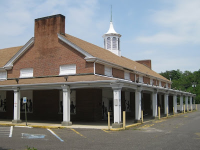
The old Acme is located at 119 Chester Ave about a block off of Main Street. The building has been purchased by the Friends School whose campus is located across the street. Not sure what relation the Friends School has with the former Friends Meetinghouse in Haddonfield. The murals you see on the windows were added by the Friends School who announced renovation plans back in 2007. At that time, their intention was to persevere the structure and to not make any significant changes to the facade. So far, no work has started on the building.

Impossible to get a glimpse inside. The indoors reflect the outer doors. I am about 100% positive this store had the Checkerboard Arch decor.

One lonely cart remains. Just about the only concrete proof that this store was an Acme. Wonder what else was left behind inside the store.

I believe the checkout stands ran along this side wall.


No loading docks. Not even a double-wide door to be found on either side of the building.

The fish-eye logo sign used to be up at the top. Not sure if this store had an updated logo in it's later years. I do have a picture of this store when it was opened but unfortunately I don't have permission to post it at this time. Maybe the owner would be willing to provide an unwatermarked version and allow me to post it, credited however he wishes?


Couldn't see a clue as to what logo was underneath the paint.


No main parking lot here. Just a bunch of smalls ones located around the property. Would have been a long walk from the rear most parking lot to the front doors.

The center section looks to be a second floor were the breakrooms may have been located.


And now for the brand-new Moorestown Acme...

As new Acmes go these days... this one is quite unique too.

The windows along the top are seen from the inside of the store as well. The decor inside is Albertson's Marketplace. The store is so huge, many aisles are extremely wide.

Located at 350 Young Avenue, this Acme must have been a huge success when it first opened. Competition has since opened up nearby. Rumors are this store is not doing very well these days.

Wegmans and Target opened up just across the street. Check out those crowds. Target with their low grocery prices and Wegmans with it's extensive fresh food offerings leave shoppers with little reason to go to Acme.

Here's a very outdated aerial shoot. The new Acme is located at the orange dot but had not been built yet when this photo was taken. The Wegmans and Target would be built in the section at the bottom of the image near the ponds. More stores were built all along to lower half of the image along the main road. Today this entire area is jammed with shopping options.

Thursday, June 24, 2010

Most Unique Acme Ever, Haddonfield NJ


Can you believe THIS is an Acme?


Photo of the original buidling which is on display at the Haddonfield store
Image courtesy of Barry Caselli 


Image courtesy of John Flack

The two story section was the original building on the property and served as the Friends Meetinghouse. Acme purchased this property back in 1954 but was required to keep the original building intact. Acme essentially built a grocery store around the old building closely matching the original design. The above image and history come to us from John's photostream over on flickr. Lots of great things to see there, especially for A&P fans.

This is how it looks today...


This appears to be Acme's original script logo. It is not. Similar but not an exact match. Acme re-introduced the script version on some smaller neighborhood stores during some 90's remodels.
Sidewalk view from the rear of the Acme. The section on the right half of the photo added on years after the Acme opened in the mid 50's. In the old black and white photo you the building ends just beyond the windows. Check out this arial shot from HistoricAerials.com... it's the Acme in 1963. Looks like a house was sitting here back then...

Click on image above to see larger version.

You can see the area where the steeple was removed. The white sign on the wall reads "F. M. 1851".

The interior of the store is not nearly as interesting as the exterior.


Looks like an old photo here but really just a weird cell phone picture.


Entrance to the left, Exit to the right. Checkout stands line the sidewalk side of the store. Let's head inside...

Chalkboard Market decor with black & white photos added on the walls which are more often seen in the Neighborhood Market decor.

Fishermen's Net opened for business in Haddonfield!

This is a look at the other side of the Grand Aisle. The Bakery is at the front of the store, Deli to the rear.


Only 7 aisles in this store. There were probably 9 or 10 aisles before the Grand Aisle was created. The wall decor here has a nice balance of photos, chalkboards and department names.

Health and Beauty Aids are in the front corner on the Dairy side. Was the Bakery located here before the Chalkboard Market remodel?


This store appears to do a healthy business considering it's size no doubt to it's ideal location in town.

Second most unique Acme coming soon...

Wednesday, June 23, 2010

Acme Style Sneak Preview... NEW Decor!


A brand new look is going into the West Goshen store in Pennsylvania. The store is currently being remodeled and will be having it's Grand Reopening on July 9th. The Industrial Circus decor has been taken down and replaced with a new twist on the Premium Fresh and Healthy decor scheme. Interior pictures and news about West Goshen come to us courtesy of Michael of PA. He has been keeping me updated on the progress of the WG store. I was planning on doing a full post after the store was done but decided to get these interior shots up right away since this decor package is brand new.

The letters are painted on sheets of plastic that are mounted onto the wall. Same font used for the Premium Fresh and Healthy look. Cheaper though to paint them on plastic than to get custom made.

This decor package is a first for Acme. Stores have never had actual photography of food items mounted to the walls. These types of photos are being more often now in decor packages. A&P's second "Fresh" decor package relies exclusively on food photography. The departments don't even have names on the walls... the bright, bold photos tell the whole story for each section of the store. I am looking forward to getting back to the West Goshen store to see the overall effect of these photos. I stopped in this store on my trip to the abandoned West Chester store which is just on the other side of town.

Target uses a similar treatment of hanging photos of products from the ceiling just out a bit from the walls. Makes it easy to change the photos in the future to freshen the look of the store.

Notice anything different here? No Albertsons leaf! It usually appears in the upper left-hand corner of the aisle markers. Michael reports that there are currently no signs of the Albertsons leaf anywhere in the store. But with about 2 weeks yet to go before the grand opening... they still have time to slap a couple leaves on the walls. Can't say I love the black being used on the signage. Most stores have the aisle markers in green or yellow but the black signs are certainly easier to read from a distance.

New treatment of the Savon Pharmacy sign.

A screen grab from Google Maps. Bing "Birds Eye View" not available for this area.

The West Goshen Shopping Center. Acme is in the lower left-hand corner. Kmart in the upper right-hand corner.

Here you can see the addition that was put on the store which I believe was done during the 80's remodel.

Check this out... there is an item on eBay from the West Goshen store. It's a letter from the manager announcing the 80's remodel. There is a floor plan on the back of the letter to show customers where everything will be located when the remodel is done. The addition to the store was probably put on during the 80's remodel. The current facade was most likely done sometime in the 90's. Interesting to note... the store had 20 aisles back in the 80's and it now has 19. One was probably lost to increase the Produce area. The person selling the item incorrectly advertises the letter as being from the 70's. I emailed the seller and explained that the logo on the letter is from the 80's and that the remodel occurred in the mid to late 80's. The seller did not update the information or respond to my email. I have purchased a few Acme related items on eBay... many of which can be seen here on the blog under the Memorabilia category... and I can tell you that the chances of this seller getting $39.99 for the item are slim. As great as the item is, I certainly would not pay that much.

Thanks to Michael from PA for his pictures and on-the-scene reporting from the West Goshen store!