Thursday, May 28, 2009

Abandoned Acme! Williamstown, New Jersey


This style of Acme was built in the late 80's. An updated and larger version of the stores that were built throughout the 80's. This type had more of a "superstore" feel to it but didn't last very long. In the early 90's, American Stores developed a new design that became the standard Acme for much of the decade. You can see a pic of this new type in the Yardley post. I'll be posting more pics in the future of these types of stores.


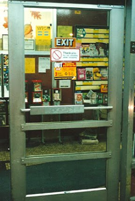
Emergency exit door in the same spot as 80's styled Acmes.


Entrance and Exit.


You can see the labelscar of the Acme oval sign.


Lonely sign with not much too offer. You can see Acme's red oval logo painted over at the top. Not sure where Jamesway had their roadside sign. Would think their's was bigger than Acme's.


A closer look.


An even closer look.


The back of the store was definitely designed for some serious sales volume.


Why couldn't just one of these doors be unlocked so I could take a peak inside? I think the interior decor of this store was probably the same look as the 80's remodel.


Image courtesy of joshaustin610s photostream on flickr

Here's another former Acme with the same design. This store is in the Lehigh Valley Mall. The picture comes to Acme Style courtesy of Josh and his photostream on flickr. Click here to check out his incredible collection of store photos on flickr!


The large store the to right was a Jamesway. I read somewhere online that when Jamesway went under the Acme suffered with less traffic coming to the shopping center.

Former Acme — Williamstown, NJ


I was down in Williamstown a couple of months ago to get pictures of the abandoned Acme in the Williamstown Shopping Center. As I was driving around I saw the sign below and instantly knew it was an old Acme sign. Pulled into the small shopping center and was thrilled to see a 60's styled store with it's Acme styling still very much intact. Aside from the blue trim on the awning, very little has been done to the exterior of the store since it was an Acme.

This location must have closed when the newer–now abandoned–Acme opened about a mile down the road. Pictures of that store in the next post.


The huge former-Acme sign. They just don't make 'em like this anymore.


Had to take some shots of the interior. Very little has been done to change the interior since it's Acme days. Just some fresh paint, new signage and carpeting.


The air vents along to ceiling were standard issue in Acme's during the 60's and 70's.


A large ShopRite is just across the street from the old Acme. Looks fairly new but may be an expanded and remodeled store.

Friday, May 22, 2009

Classic Acme! Somers Point, NJ

The following pictures have been kindly provided to Acme Style by Michael Lisicky of Baltimore Maryland. They are absolutely incredible and I am very grateful for his contribution. A classic pitched-roof store with minimal changes from it's very first day of business. These pictures are the only ones I have seen that show off the 60's/70's colonial style decor. If you look closely you can see store signage with the "Check it out Acme Style!" tagline... the inspiration for this blog! Michael's most excellent story of this store follows the pictures below....


(Images above courtesy of Michael Lisicky)

I spent my earliest years growing up in the Somers Point, NJ Acme. For years it was the only game in town. Somers Point is located across the bay from Ocean City, NJ, home of its own 2 Acmes. However Ocean City had its famous blue laws and even to this day is one of NJ's famous dry towns. During the height of summer, Ocean City retail would shut down on Sunday and hundreds of people would flood Somers Point for groceries at the Acme. I'll always remember that for years the Acme was open Sundays from 9am until 2pm. By 1:50pm, people would be literally running to the doors of the store hoping the manager was not there to turn them away. (Why wouldn't they stay open longer?, I used to think.) This style of Acme, my personal favorite, didn't have regular doors. In fact, it only used its doors when the store would close for the day. Even in the height of winter, Acme's doors were always open. And then you would enter that famous wind tunnel where all of the sudden temperatures returned to normal.

I could go on for days about my love for that particular store. In the mid 70s, Starn's Shop-Rite opened across the street and took Acme's business right out from under it. However, Starn's also did not open on Sundays. So it seemed that the Acme stayed in business just because it made enough money on Sunday to cover its sales goals for the whole week. Soon the store stayed open later until 3pm, then 5pm and soon it was 9pm. Eventually Ocean City relaxed its blue laws and Starn's opened their doors on Sunday. And for some reason, the Acme, which seemed quite small by the 1990s, somehow stayed open. My mother always preferred the Acme to Starn's. It was just easier to shop there. Not many cars. Not many people. It was a large scale version of a convenience store. And oh that smell. Not an unpleasant smell but definitely a grocery store smell. Some older Acmes still have it.

By the 1990s, Acme decided that it wanted to stay in Somers Point but not at that location. So it built a mega-Acme across the parking lot. It would finally hope to truly compete with Starn's but they too would build a newer and bigger store 10 years later. Starn's, now just Shop-Rite, still gets more of the business. Its prices are probably a little better but its parking lot is still just awful. Even the new Acme is easier, and quieter.

The new Acme opened just after Thanksgiving 1994. While I was visiting my father that year I dropped by the old Acme to say 'good-bye'. I spoke to the manager and he gave me carte blanche to take whatever pictures I needed. I'm so glad he did. It brings back fond memories. Memories of another era, whether it be style or just simplicity. I hope you enjoy my farewell pictures of the Somers Point, NJ Acme.

Michael Lisicky
Baltimore, MD

Thursday, May 21, 2009

Abandoned Acme! Washington, NJ


I always knew there was an Acme in Washington New Jersey but had no idea where Washington was. Thanks once again to Live Maps, I was able to track this Acme down. Sorry to see it has long been closed and abandoned. A 50's/early 60's styled store that has very little done to the exterior since it first opened.


Looks like the green section was added on in the early 90's. I am guessing that this store had the fish-eye sign up against the brick (as can be seen in the Egg Harbor City pictures). Looks like the sign-age went from the fish-eye right to Acme's new block letter logo. Both the fish-eye sign and red-oval would have been placed in a cut out section.

Another difference from most North Jersey stores is that the window on the right side were never replaced with opaque panels. This was done to allow for shelving to be put in on the inside and for the produce or floral departments to be expanded. At this store, they simply painted the inside of the windows just half way up.


Entrance and Exit to the left. These types of Acmes were most commonly free-standing stores. Looks as though there may have been some sort of drug store next door.


I never know what I am going to see on the interior when I walk up to these abandoned stores. This one has the checker-board arch decor of the early 90's. That look is still in use at the store in Manasquan NJ. But at this store only blue and green are used for all the departments. In Manasquan the Meat and Dairy departments are checked in red and dark blue.


This decor package followed the 80's remodel. But it looks like this store was skipped in the 80's as it doesn't have the checkerboard floor. Must have gone from the 70's colonial decor right to this. Acme stuck with the arch look for 3 rounds of interior designs. The next look came in the early to mid 90's in newer stores. Much more delux decor of course but arches nonetheless. I hope to do a post soon just dedicated to Acmes's interior looks over the decades.


The green lights were over the free standing produce tables. That dark area on the bottom left was probably the greeting card rack. "Lunch Meats" to the rear of the first aisle.


The deli was straight to the back. The orange panels are, of course, remnants of the 70's decor.


"Meats" to the rear. Cool blue light bars over the registers. I only count 7 aisles in this store, the first one only being half an aisle.


"Dairy" to the left. The orange stripe is left over from the 70's dairy decor.


Office/Customer Service. The classic Acme clock appears to have been removed or maybe was never at this location. The clock was built into the wall over the customer service area on the Dairy aisle wall. It might be blocked by that wall that has been put at the start of the dairy section.


Must have been a pretty busy store with 6 registers in place til the end. Most stores went down to 5 or 4 to expand the sales floor space.


Cool decorative awning hanging by the front windows.


Maybe this was the floral/plant area.


All the holes in the green section seem to indicate that this store had the latest Acme signage.


Another unusual aspect of this store is that the Produce department backed right up to the exterior wall. There was no backroom like in most stores of this style. There must have been some building restriction here that caused Acme to alter it's standard design. Here the backroom sticks out from the rear third of the building. You can see this better in the areal shot down below.


Great sign at the entrance of the parking lot.


Here you can see the unusual backroom area sticking out from the building. This does not look like an addition close up. Looks original to when the building was first built.


Here's a look at the old school ShopRite on the opposite end of town. I drove past and even pulled in but didn't go in the store. Looked very unappealing. I find ShopRite to be the least interesting grocery store chain in existence. Apologies to any ShopRite fans who may be reading this.

UPDATE 2.10.10: For not being a high volume store, the tiny little Washington Acme did get some surprising attention from the company. Was still looking good back in 1999...


Images above courtesy of Rob Ascough