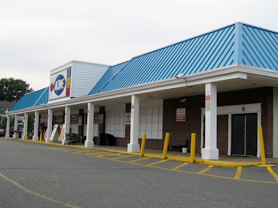
WORLD'S MOST CLASSIC ACME!
That's right... you will not find a more classic Acme still open for business anywhere in the world than right here in Manasquan New Jersey. Let's review some of the classic elements...
- Only Acme remaining with the fish-eye logo sign on the front
- The exterior has had no major changes since the store first opened. The roof over the awning has been covered in blue siding but no additions or substantial reconfigurations have been made to the outside.
- The original interior layout remains virtually intact for the entire lifetime of the store. This store has never had a floor to ceiling remodel. Upgrades and decor changes have been done but no significant changes have been made to the layout.
- Sections of flooring have been switched out but the original Produce "faux slate" floor remains and is in remarkable condition. The other Colonial Decor colored tile sections in each department have been removed.
- A Produce alcove was never created in this store. Produce still lines the wall along aisle 1.
- The original recessed spot lights above the Deli department remain.
- Customer Service and registers have been updated although the layout of the front end remains mostly unchanged.
This Acme has been covered in a previous post which you can view by clicking here. We will be revisiting this store as part of the Jersey Shore Tour...
Best grocery store sign ever. Period.
The old bread delivery door here on the side. The bread delivery room is now used for the store's computer system.
Produce receiving doors here on the right. Front windows have been covered over like in so many old Acmes to allow for shelving on the inside.
The Checkerboard Arch decor... an Acme Style favorite. Very few interior shots were posted the original Manasquan post so I will be making up for that in this post. Plus, I have a much better camera on my cell phone these days. Notice the signature Acme vents along the top. Produce and Dairy cases appear to be quite new. Meat and Frozen cases appear to be from the 80's remodel and were probably brought in from another store that closed. This store was not remodeled in the 80's.
The Colonial Decor "Deluxe" floor. Quite a site. Still looks great in this store. This was one of Acme most signature deign features in their stores during the 70's and early 80's.
Would you look at this. Aisle markers from the Industrial Circus decor package have been brought in probably from a closed store. The last time I was here the aisle markers matched the decor. Not anymore. Kinda baffles me. Now the aisle markers hold less categories and clearly don't match the decor of the store. Newer isn't always better.
Although this look is a little dated now, it was the perfect fit for Acme when it was rolled out in the early 90's. The deluxe version had many nice touches and the overall look was one of the best fits to Acme's personality that the chain ever had... in my opinion anyway.
This Jersey Shore store is loaded with beach chairs. And with this decor, Acme raised the department names to the roof line so they could still be seen with tons of general merchandise stacked on the cases.
"Bakery" is now all Dairy. Bread is over in aisle 8.
The old fish-eye Acme clock. Every store had one. Ads were placed in the red section but I'm sure whatever company took care of that is long gone these days.
This Jersey Shore store is not quite within walking distance to the beach. May not be alot busier in the summer than the winter. Manasquan is more of a regular town than a summer resort town. I was surprised at how many other grocercy stores I passed driving through a few towns North of Manasqaun... Foodtown, ShopRite, Super Foodtown, A&P.
You are now leaving...
WORLD'S MOST CLASSIC ACME!


Hey Acme Style. I think you may have made a typo on this post. You said the aisle markers are from the chalkboard market decor but aren't those the markers from the industrial circus decor?
ReplyDeleteGood catch! Thanks!
ReplyDeleteThis would be a fantastic supermarket if not for that ugly blue roof, which really ruins a great deal of this store's charm.
ReplyDeleteI remember seeing that Acme clock at the Egg Harbor City store before it closed in 2002.
ReplyDeleteThe blue roof would have been even uglier if it were green which is what most of the older stores got. See the Newton NJ store.
ReplyDeleteI guess I don't mind the blue roof- it sort of matches the blue in the logo. I agree that this is a really nice store, almost stuck in a different time. Too bad about those Industrial Circus aisle markers- I don't recall them being there when I visited the store earlier in the year so they must be a relatively recent addition. I can't remember anything wrong with the old ones, so either I wasn't paying attention or it's an example of change for the sake of change.
ReplyDeleteThis checker board design was also used in many star market locations in Massachusetts when it was owned my American Stores
ReplyDeleteStar Markets will be a "Bonus Store" in the very near future.
ReplyDeleteGlad to report that this IS a very active store in the summer months. VERY. I took 18 pallets of groceries there on a Sunday, then on Thursday another 16. This is all summer long. Lyncroft may get much more, but for the size, Manasquan rocks. (very clean for this old store)
ReplyDelete