Friday, January 28, 2011

Soon-to-be former Acme – Limerick, PA


Location: 31 West Ridge Pike, Limerick, Pennsylvania

The Limerick Acme opened in the spring of 2007 and has struggled ever since. Giant, paired up with a Target, opened 6 months earlier just across the street and proved to be the bigger draw for grocery shoppers. The Acme is set to close by the end of February just shy of it's 4th anniversary which qualifies it as a "crash and burn" here at Acme Style. This store, along with many others that were built throughout the 2000's, never stood a chance largely due to the lousy locations where they were built.

In a desperate move back in February 2009, Acme closed it's nearby store in Collegeville in hopes of luring Acme shoppers to the new Limerick location which was about 5 miles away. Clearly that plan didn't work. Collegeville was still a successful store when it closed but was facing competition from a Wegmans that was being built nearby. The Collegeville store remains abandoned to this day as Acme continues to hold the lease to prevent a planned ShopRite from moving in. 

The Limerick Acme has a very contemporary exterior design not seen on any other stores in the chain. I'm not sure if this is the newest Acme to have been built but it's certainly one of the very few stores that have opened in the past 5 years. The interior is the original "Premium Fresh and Healthy" decor. The jury is still out on that decor package. It is attractive yet extremely dark. With no new Acmes on the horizon, this may be the last original decor package we'll see for the chain. Stores currently under going remodels, are receiving a redesigned version of the Premium Fresh and Healthy look.  

One element not seen in Acme stores for decades now is windows along the front of the store. Grocery stores generally went windowless in the 90's as the front walls became populated with customer service departments, banks and pharmacies. Checkouts line the windowed wall here with no merchandise along the wall to block the view to the outside... just like the good ol' days of Acme.

The Pharmacy is located on the right-side of the store along with a drive-up on the side of the building... 


 The Pharmacy closed on January 18th.


Looks like someone forgot the "your" or at the very least... "the".

Some very blurry images to come. With the lack of merchandise and shoppers and an abundance of employees, it was difficult to be discreet while taking pictures. I had to snap pictures quick and keep moving. I was going to ditch the blurry ones but decided to include them since they still give a good idea of how the store looks. 

The Deli was still open but with very limited selection. The Bakery was shut down. Most service departments around the store were completely wiped out. Strangely enough... most grocery shelves were still fully stocked and there were no %off sales in progress. In fact, I saw no signage that mentioned the store was closing. 


Here we are in the Wild Harvest section of the store. I was very surprised to see it fully stocked. All straight aisles here too. Other stores have the "Shop the World" section to the rear with oddly angles aisles which make for a strange shopping experience. 


A couple of grocery aisles are starting to empty out. When I was here, there was an announcement made that "the Acme truck has arrived!" I was surprised to see quite a lot of employees in the store. Some just going around blocking merchandise on shelves. 

Dairy is along the back of the store and continues over to the left right wall. 


Not quite 20 aisles. 20 is the back half while 19 is the front half. 


Do people still get pictures developed? It has to be at least 5 years since I last dropped off film anywhere.  I will say... that P drives me nuts. I've seen it this way in other stores. It could have easily been dropped down to be lower case like the "y" was over in the bakery. 

The employees were very friendly and as much as I wanted to, I didn't have the heart to ask when the store was closing for good. 

UPDATE 2.13.11: Some additional interior photos have come in. Much sharper that the ones I had taken...


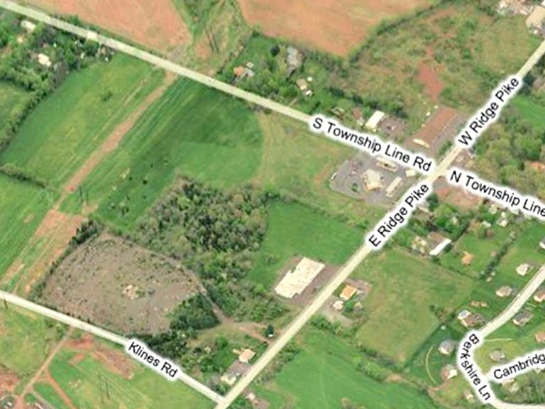
Until just very recently, the aerial shots of this area showed the land undeveloped. 


But now the Acme does show up in the satellite images.


Sad parking lot. Wait until you see the crowds over at Giant.


Giant be jammin'. Look below to see how both store's parking lots compare...

Yep, nobody shops at the Acme. Would it kill them to be competitive? Why spend all the money to build a new store and then just get crushed by the competition?  
 
And now let's head over to Giant and see what's so great about it...

During the 90's, I was a fiercely loyal Giant shopper and was quite convinced that it was the best supermarket chain I had ever done business with. (Sorry Acme) After relocating to New Jersey, Giant was no longer an option. I then began shopping at Edwards which was Giant's sister chain. A few years later, the Edwards banner was inexplicably eliminated in favor of the far inferior Stop and Shop banner. All chains are owned by Ahold, yet none, including Giant Maryland division, come close to the excellence that it is Giant PA. (Giant MD has a similar logo and uses the same fruit bowl icon as Stop and Shop).

In the early 90's, Giant had an aging fleet of stores. Some were so painfully dated it was hard to understand how they were still open. Early in that decade, stores began to be remodeled at a dizzying pace. By the mid 90's, it was hard to find a store that hadn't been extensively upgraded and remodeled from floor to ceiling. Heading into the late 90's, Giant showed no signs of slowing down and began building larger replacement stores for many of the previously remodeled locations. Within 10 years the chain had virtually reinvented all of it's stores and drastically increased it's store counts. I don't have any statistics to back this up but from my obesrvations alone, Giant appears to have one of the most aggresive remodel and new store construction plans of any chain out there.  

In the mid-90's, Giant started rolling out very interesting store decor theme which continues to this day. They favor a rather cartoonish look to their department signage with no expense sparred on decor elements throughout the entire store. Throughout the 90's Giant, like Acme, was big on the all-white interiors. They have since switched to warmer color schemes but keep a very playful sense to the decor. 


Why make the Butcher Shoppe appear high-end when you can make it look fun!

Very nicely designed pet aisle decor.

And more great design down the frozen food aisle...


Back in the early 90's, Giant was refused to jump on the trend of requiring customers to have a card to qualify for sale prices. In fact, the company's quirky president Alan Noddle, explained in TV commercials that no card was needed to shop it's stores and that sale prices were available to everyone. A few years later, Giant gave into the trend and began issuing it's "Bonus Card". Unlike other chains who always seem to be rebranding their pricing themes, Giant has stuck with it's "Bonus Buys" theme since the 90's bringing consistency to the chains pricing policy. Other stores, such as A&P and Pathmark, desperately change their pricing themes and ad campaigns far too frequently hoping something will eventually resonate with shoppers.  
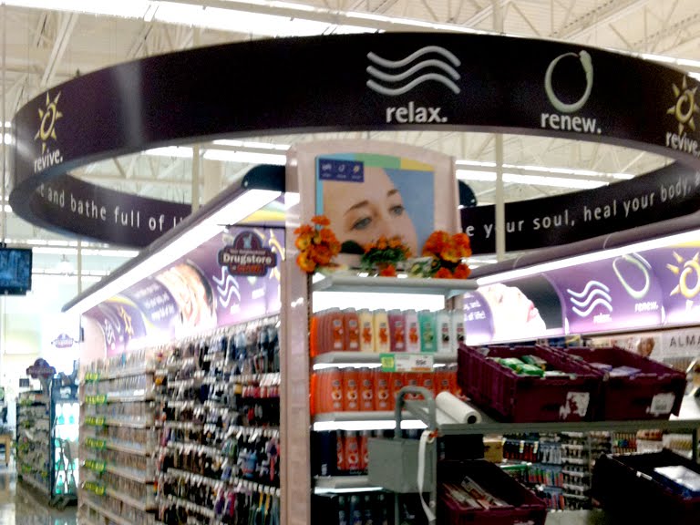
Stop and Shop has the "relax. renew. revive." theme in Health and Beauty as well but Giant takes it to another level. It's still hard for me to believe that Stop and Shop and Giant are related. The difference between the two chains is night and day.

The Corner Bakery still located in the far front corner of the store. Giant is one of the few chains that hasn't bumped the Bakery over to perishable and service intensive section of the store. 


Giant's signature front end. The register lights are standard issue throughout the chain. Sure beats Acme's hideous, generic register lights which just get junked up with advertisements that no one cares about. Nearly every register was open here... with lines.

Day care at a grocery store? Giant's got it!

Giant and Target... a killer combination that put Acme out of business. 

Sunday, January 23, 2011

Acme's 120 years old!


Yesterday I went on a huge Acme road trip and discovered some interesting things along the way...

• It's Acme's 120 birthday! Stores were celebrating with cake and soda at the front end. Store signage was limited regarding the celebration. The image above is a picture of a sign outside one of the stores (hence the slightly odd angle of the logo.) I did see a chip display that had this logo printed all over it and the logo is also on the front of this week's circular. Looks like yesterday was the official kick-off of the celebration.

• 10 for $10 promotion finally over? Acme unveiled this promotion years ago. It was catchy at first but soon every other stores on the planet offered the same kind of deals. As it ran it's course elsewhere, Acme stuck with it. Never really made sense to me... you didn't need to buy 10 items to get them for $10. And there were always more items on special than just 10. Oh well... looks like they've taken a simpler approach and now just have the "$1" sale. The 10 for $10 departments appear to have been rebranded as "Great Deals!".

• Less is more? One of the most interesting things I noticed in store after store, was the mass reduction in random displays up and down the aisles and along the front ends. Was this just a coincidence or is Acme reducing the clutter? Stores seem to be more streamlined and organized. Particularly along the front end. I was in several smaller stores which are normally packed to the rafters with merchandise. That wasn't the case yesterday. Gone too was all the general merchandise that is normally stacked on top of the aisles and on top of the cases around the perimeter of the stores. I was only in about 8 stores so it's hard to declare a chain-wide trend but as Acmes go I was surprised... and impressed... to see so much open space and a seemingly new level of organization.

Friday, January 21, 2011

Soon-to-be former Acme, Fallston MD


Photo above courtesy of Michael Lisicky of Baltimore

Location: 2315 Bell Air Road, Fallston, Maryland

ABC2 News broke the story to Fallston residents
in it's January 4 newscast. 

The following exterior photos courtesy of Drew in Baltimore

The Fallston Acme comes to us through photos from several Acme Style contributors. I had hoped to eventually get to this store to experience it for myself but my hopes were dashed when the recent store closings were announced. Fortunately our contributors did an outstanding job capturing the store.

A classic "33M" format which appears to be in rather excellent condition. The red paint job is certainly an unusual treatment for an Acme. It is a huge improvement over the light green color that was used during the 90's. Interesting to note the shingles as opposed to the standard corrugated metal.

The Fallston Acme is closing largely due to the anticipation of future competition. Walmart is building a huge new store just up the street and the Acme is getting out of town before it opens. Plans have been underway since 2007 but have been delayed due to Walmart acquiring permits to build the store and to make necessary road improvements. The store was initially designed to be 147,000 square feet with room for an a possible expansion of 57,000. I can't find confirmation online as to what the final size will be. Either way... the store will be stocked full of low-priced groceries. Wegmans was also shopping for a site in Fallston but has decided to go with a site 15 minutes away in Abingdon. Construction is well underway there with a planned opening this spring.

The block letter logo sign is a very recent addition to the store. More details on that down below. 

A great exterior shot which gives us a clear look into the store. Can you name that decor? Let's head in and take a closer look...  

Produce shote courtesy of Gary of Delaware

Judging from the interior photos taken by two of our contributors, I would have to say this store is in exceptional shape. The 80's decor has been traded out for the late 90's "We gotta sell this supermarket chain" Convenience Store decor. Doesn't look too bad here. The 80's checkerboard floor is still in and place and is looking as good as I've ever seen it so many years later. 

The shot above is an excellent perspective of the Produce department of the "33M" store formats. During the 70's and 80's, these stores had an additional aisle running just under the edge of the drop ceiling. Produces cases lined the wall mirroring the cases on the left wall forming a narrow Produce aisle. Grocery shelving ran along the other side creating a true aisle 1. This aisle was removed throughout the 90's, sometimes during a remodel and sometimes not, in order to expand Produce. I would be interested to see the tile work here along the area where the aisle once stood. Did they try to recreate the checkerboard pattern where the shelving once was or just put down all white tiles? (Yep, these are the kinds of questions I need answers to.) The removal of these aisles certainly helped open up the Produce area which was often very cave-like in 70's and 80's stores. 

Interior shots courtesy of Michael Lisicky of Baltimore

You can clearly see here how well this store is maintained. Fully stocked shelves with merchandise neatly organized. And... stop the presses... no burned out lights!

Check out those aisle markers. Deluxe versions of the 90's Red/White/Blue aisle markers which I have only ever seen in Convenience Store remodels.


This is the only "Convenince Store" remodel I've seen with "Lancaster" branded Meat Department.

This store did not get the blue stripes and red blocks along the lower portions of the walls.

The Bakery Department in the front corner. Checkout stands straght ahead. (We're not following this guy... the guy you may have seen at the checkouts has a blue shirt and white shorts.)

Serious old-school clock here. These went into every Acme back in the early 80's. The old fish-eye logo still on the clock. The other section was used for advertisements that would be switched out every couple of months. I would imagine that the company who handled this no longer exists which is why the generic "Thank you for shopping with us" panel is now in the display. Oh, do I remember staring at one of these clocks just waiting for my shift to be done.

Exterior shots courtesy of Gary of Delaware

The red oval sign still on front as of October 2009, making it the last store in the chain to be upgraded to the block letter logo. The Newton and Princeton Junction stores in New Jersey both made it to 2009 with the red oval sign but closed that same year.

Other signs around the store had been changed out with the newer logo. Notice the interesting wordwork which runs throughout the shopping center.

Gary gives us a nice tour around the store...


And now back to Drew's more recent pictures where we sign the other signs having been upgraded as well. The letters have become more bold over the years.

Soon to be alot more space available in this shopping center.

Now for the aerial perspective...

The CVS is right next to the Acme. Somewhat of an odd layout for a shopping center. The stores or offices next to the CVS are tucked away from view from the parking lot.


The shopping center itself is tucked away from the main roads through the area.

Google Maps shows the Walmart under construction.

1971
HistoricAerials doesn't offer much to see for this area. The shopping center had yet to arrive as of 1971.

2005
The next available image is 2005.

The bottom half of this sign could now be replaced by "Shop at Walmart". Sad but true. Acme isn't the only chain being killed by Walmart. Won't be the last either. I've worked for two companies that have nearly been destroyed by the ruthless chain. Two reasons, among many, you'll never find me shopping in one.

Thanks to Gary, Drew and Michael for bringing us the Fallston store!

Update 1.26.11: Some additional photos have been sent in by Will which show the store winding down it's business. Closing signs are up in the windows and shelves are emptying out. We get a look at some additional departments in the store that weren't seen in earlier interior shots...


Tuesday, January 18, 2011

Blast from the past! Secaucus, New Jersey


Classic Acme photos courtesy of smiley1999

Location: 1300 Paterson Plank Road, Secaucus NJ

The picture above dates back to the late 50's/early 60's. The photo was sent in by smiley1999 along with some other classic photos which will be featured in future posts. The Secaucus store was covered on the blog back in October 2009 in an extensive 3 part series chronically it's demise. A recap of the Secaucus saga can be found at the bottom of this post. Directly below is a picture from the original post which was taken in the store's final days in 2004. 

Although the store appears to have been enlarged over the years (looks wider in the 2004 shot than in the old black and white shot), I am quite certain it was not. The awning that was added since it's early days gives the illusion that the store had been expanded. The Acme building and it's relation to neighboring stores can be seen more clearly in the satellite images below.

The image above are the stores to the right of the Acme. You can see a portion of the strip in the photo below as well circa 2004. 


The Secaucus Acme is currently a CVS as shown above. A very nice farner's market has moved into the store to the left satisfying some of the grocery services that left this part of town when the Acme closed.


Now for a quick recap of the Secaucus Acme's demise... this was one of those rare occasions where the Acme wasn't interested in giving up. In fact, in the early 2000's Acme wanted to expanded and extensively remodel the Secaucus location which had been virtually untouched since it's 80's remodel. At that time it's only competition was a Stop and Shop (formally Edwards) across Route 3. The Walmart and Sam's Club had yet to come to town. 

Acme submitted plans to the landlord which included an expansion into the neighboring stores. The landlord balked at Acme's plans and their intention of evicting other tenants. Acme followed up by submitting new plans which called for the renovations of their current building only. The landlord refused to consider the new plans and informed Acme that their lease would not be renewed.

Quite an unfortunate end to what could have been the beginning of a very successful chapter in the story of the Secaucus Acme. In the years since the Acme left, many other tenants have left as well, at some points leaving nearly half the center unoccupied. A reshuffling of tenants to make room for the Acme expansion would not have been impossible. It also would have been an opportunity for the landlord to fix up the shopping center which to this day is still in sad shape. The Stop and Shop has since closed as well, apparently unwilling to compete with Walmart. The Acme would have been the one supermarket that the town of Secaucus could access without going out on to Route 3.