


Location: 507 Prospect Ave, Little Silver, NJ

Little Silver has one of the oldest A&P's still in operation today! We're talking pre-Centennial days here. Exact opening date is unknown but according the the historic aerials, the store has been up and running since at least 1957. Started out as a barrel-roof model and had a small expansion to the right side in it's early days. A larger addition was added to the left side when the store was converted to the Centennial format sometime in the 70's.

Judging from the current exterior design, one would expect to find an old decor package inside, perhaps similar to the one we saw in the classic Morristown A&P. Turns out this location has been extensively remodeled with the second version of the "Fresh" format. Why they couldn't scrape together a few more bucks to convert "Food Market" to "fresh market" is a mystery.

Differences in brick color along the front appear to indicate the seams between the original building and the Centennial retro-fit.
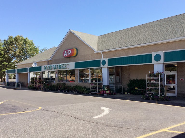
The door configuration is a little confusing from this side. The vestibule has only one door on this side which serves as an exit. The main entrance to the store is the rather nondescript door on the left side of the photo. I would imagine plenty of unfamiliar shoppers head toward this side's exit door. At the other end of the vestibule, there are side-by-side entrance and exits doors.

Maybe a nice "Welcome" sign up in that window would help this lonely door out a bit. Right now, it is in no way conveying "Main Entrance"!

There may have been entrance and exits doors here at some point. I didn't think at the time to look for a magic carpet scar under the plants.

Heading inside for a look at the rather impressive interior...

So A&P took the full-scale, second version of their "fresh" concept and crammed it into this small store, minus the Pharmacy.

The deli and cheese departments were moved onto the sales floor directly across from produce, stealing a significant amount of space from the center store. They even managed to fit in a juice bar, pizza station and prepared foods! Must have cost the place a good 3 grocery aisles. The store now tops out at a measly 7.

A look toward the front-end from the prepared foods counter.

For the second version of the "fresh" decor, A&P gave up on naming the store's departments, relying instead on product photography. Pretty great photography at that. We will be reviewing all 3 fresh market formats after we wrap things up in Little Silver.


The lighting here is very similar to Acme's original Premium Fresh and Healthy stores. Light focused directly on merchandise with very little serving to illuminate the store in general. This store in particular is very dark. Almost gloomy inside. I had to pump up the lighting in Photoshop just so we could see everything clearly.

Bakery all the way in the back. This store isn't far from Acme's Fair Haven location which is similar in the sense that it is very small but has been maxed out with as many modern amenities as possible. The approach leaves both stores very crowded with merchandise. This place must be a nightmare when it's busy.

The view toward the front-end from the bakery.


The blue seafood sign is quite striking.


Aisle 1 with the left side lining the wall behind the fresh food departments.

Some classic air vents down this aisle!


The columns are most likely where the wall of the original store was located. Not sure what aisle this is exactly.


The 7th and final aisle...


Additional frozen food in the front corner.


The second version of the "fresh" concept saw the A&P sign losing the orange and yellow sections.

The ceiling in this section is in need of some help.


Scars from the magic carpets that were once here. This section of cement appears to be original to the building.

Newer cement further out from the doors.


There was some activity happening back here so I didn't venture around for any more pictures. You'll be able to see some more details in the aerial views.

Aerial Images...

The arched-roof section in the original store with additions done to both sides of the building.


The barre-roof model had a second floor to the rear. Very similar to how Acme pitched-roof stores were set up.

Historic Views...

2007

2002

1995

1979
Centennial retro-fit and expansion completed by 1979.
1969
The parking spots originally ran parallel to the A&P. They were switched to run parallel to the strip mall by 1979.
1963
The addition to the left side was completed by 1963.
1957

1947

Bonus Content:
A&P's Fresh Formats!
A&P's Fresh Formats!
Version 1: "Fresh Market"

Location: 125 East Main Street, Denville, NJ

The Denville A&P was the very first "fresh market" store, opening in 2004. The Centennial store that was originally located here was torn down to make room for this much larger store. At the time, "fresh" was a catchy approach and certainly brought A&P a lot of attention. It wasn't long after that it seemed like every chain was attempting some sort of
fresh makeover.

The decor package in this version consists of back-lit letters for the the department signage and large, colorful sketches of fresh foods.


A&P incorporated more prepared food offerings in this format and added more gourmet products like fresh baked artisan breads and a gelato bar. I was here right after the grand reopening and had some of the gelato. It was an icy mess. The cases were clearly not keeping it at the correct temperature. They wound up getting rid of it.


Cases throughout the store are lined with montages of vintage A&P photos. A really cool feature that would be eliminated for the other versions of the fresh format.


Version 2: "Fresh"

Location: 125 18th St, Jersey City, NJ

A few years after the "Fresh Market" look was rolled out, it was completely ditched in favor of a new version. While we just saw this version in the Little Silver store, I'm including pictures from the Jersey City location which I took a few years back. I believe this store was remodeled around 2010. You wouldn't believe the place if you saw it prior to that. It started as a Waldbaums which was converted to A&P at some point. A&P did nothing to the store but change the name on the front. Inside was all 70's yellow from floor to ceiling. What was so incredibly bizarre… the department signage looked like it was painted by 3rd graders. Seriously. The deli was called something like "The City Deli" and had a very amateurish painting of a city skyline. Equally amateurish signs were above all the other departments as well. This area of Jersey City really started to take off in the early 2000's. I figured A&P was just letting this store die a slow death, which is exactly what it was doing. An insanely busy, yet nasty, ShopRite is located about 8 short blocks away. A&P finally showed some faith in this place and gave it an extensive floor to ceiling remodel. Business exploded! In the early years, they had to bring in portable registers to help handle all of the business on the weekends.


You can see the layout here is very similar to Little Silver.


Frozen Foods was moved from the center of the store to the dairy side.


The Pharmacy is the only department that gets a name!

The Pharmacy was moved from the entrance over to this corner. The Health and Beauty Aid aisles were located where the deli and prepared foods departments now stand.

Not much was done to the outside here except for some new paint and sign. You can see from here the parking lot gets pretty full. Certainly a major success story at this location!
Version 3: "Funky Fresh"

Location: 2101 Route 35, Holmdel, NJ

We'll be taking a look at the third (yet not final) version of the fresh format in the extensively remodeled Holmdel store. The interior here is pretty extraordinary. The astronomical cost of this version was a contributing factor to A&P's bankruptcy in 2010.

Each department here assigned an icon which were tied into the website at the time. That's no longer the case. You can see the flower icon next to "fresh floral".

I've been to the Holmdel store several times. From what I've seen, I can't say business is booming here.


Check out the product photography. See anything interesting there? Each sign is in the shape of one of A&P's logos!

I personally think A&P need to overhaul its bakery selections. I thought there were be some great new items to be seen here in this store's bakery. There really wasn't.


Ambitious layout here. The whole store is set-up more like a gourmet market than a supermarket. Aisles run every which way which is pretty confusing.

Even the cleaning supplies get treated like their own separate department.

Most of the aisles are much lower here.


Dairy in the round.

Frozen Food is pretty cool. It's located in a large alcove in the front corner of the store.

A simplified version of this decor was used for the short-lived Pathmark Sav-a-center remodels.

Center aisle.

More icons for these departments...


Very cool concept here and definitely worth checking out. Would I like to do my weekly shopping in this crazy concept? No. Fortunately it is no longer being used. Once bankruptcy was declared, this version of the "fresh" format was terminated. In a strange twist, A&P reverted to the the first version for their newly built store in New Providence, New Jersey. It was also used in the new North Liberties Superfresh in Philadelphia. That store was originally planned to be a Pathmark but switched banners after the two companies joined forces.
And this concludes the tour of A&P's fresh formats! Have a favorite? Mine is, hands-down, version 2!
From What I've Seen In The Post Above," The Funky Fresh" Store Was Completely Crazy Interior, And The Signs Did Look Like A&P's Logo! Who Knew!
ReplyDeleteThere were also some on LI that have (or had, in the case of closed stores) different decor despite being labeled as "Fresh Markets." A picture from the now closed Lake Ronkonkoma store:
ReplyDeletehttps://foursquare.com/v/waldbaums-ronkonkoma-ny/4bf889ab92d195215f3f5a1f
Selden also looks similar, IIRC.
That was the last decor package before A&P started with the "fresh" interiors. They may have upgraded some things in that store but it doesn't look like it got the full remodel,
DeleteWhat about the interior from the Former Super Fresh in Fairless hills, Pa before it became a shop rite.
DeleteThat former Super Fresh had an older decor package.
DeleteKiss the old decor goodbye. The former super fresh is being renovated by shop rite who bought the store in 1999
DeleteThe front most likely had entrance and exit doors on both ends of the "vestibule" at one point - I remember a similar set up from at least one store in this area which was a similar design/time period as the centennial "retrofit" you mention.
ReplyDeleteDid the doors on the left have double (ie you had to go through 2 sets of doors, but fairly close together) doors?
If so, that is the original set up, where the single exit door seems to have gotten a longer "walkway" between the inside & outside doors.
Probably done when this was remodelled as well as creating that new Entrance door to create that "entry" into the fresh foods (which is similar to some of the newer store designs).
Quick question - For version 3 - which store is that actually. You reference the address 3500 Route 9 Old Bridge Township, but then also say the Holmdel store.
A&P has 2 listings on it's site:
3500 Rt 9 Old Bridge Township and
2101 Route 35 Holmdel
I don't remember that design (would think it would be hard to forget) and have been to the OBT one, but it may just have been before it was remodelled to that (since you mention it being just before the 2010 bankruptcy).
I had the wrong address! It's been updated. Thanks BillyGr!
DeleteAcme Style, GREAT job with this post! I like how you've detailed each of the fresh market versions which as you said can be confusing from store to store... the Holmdel store originally was a Super A&P food market as they were called before the fresh market concept, and that Funky Fresh was A&P's attempt to combat whole foods but it never took off, even in the smaller Park Ridge store which has the same decor... and as you noticed, that Holmdel store does very little business compared to the Best Market which is across the highway in the other upscale shopping center. Can't figure that one out... but anyway,not sure I undrstand why A&P went from the red, orange & yellow oval to the the red oval, to now the red circle. My understanding was that Jon Scott, an A&P CEO before James Wood (early 80's) picked that logo to signal A&P heading into the future. Well, I guess the future isn't so bright any more for A&P, and maybe thats why they dropped the orange & yellow bright colors on the logo!
ReplyDeleteThanks GUman! I see that A&P js now updating their street and parking lot signs with the red circle but leaving old signs on the front of the stores.
DeleteYeah, its kinda weird how you can see all 3 logo's in some of the stores now depending on which store you go to and what they've decided to change... at their West Paterson/Woodland Park store, the Tinton Falls store & the Oak Tree rd. South Plainfield store, the highway sign is changed with the red circle and lighter green, but other areas of the store have the red oval and also the 3 color logo. They've also opted to call the stores "Food & Drug" on those new signs, both A&P & Pathmark as some new Pathmark Hwy signs say... (Hazlet)
DeleteI've seen a pic of the West Paterson/Woodland Park (AKA Little Silver) A&P Fresh on Flickr. It's building (90's steel) front facade looks exactly like the Pathmark Sav-A-Center (former Super Fresh Super Store) at 2101-41 Cottman Avenue
DeleteThis is an awesome post. I loved the A&P and it is great to have this little guide to the fresh decors. The company really threw me off when they remodeled one of my Waldbaums with the updated version of the first one since A) I was not expecting ANY remodels let alone in a store which was last remodeled in 2004, and B) I was getting ready to eventually have a "crazy fresh" more close by. Speaking of the 2004 remodel, that is the decor package which the anonymous commenter mentioned with regard to the sadly deceased Lake Ronkonkoma store, that instance of the package appears watered-down due to how it was installed. It lends itself better to '90s built stores with light boxes, etc.. Anyway, when the fresh format was launched near me, stores received that package, along with some serious revamping of some departments. I always regarded it as the first of the fresh remodels, especially since the "fresh market" branding appears on signage in the entrance vestibules. Jericho, NY, an '04 Pathmark converted to Waldbaums has a HUGE fresh market sign near the front, and it features this older interior, with which it opened, all while A&P was promoting it as a fresh store. That decor bears a strong resemblance to the previous early 2000s one with the snazzy font and color scheme, but has superimposed photos of people enjoying food. They also remodeled Selden, Lake Ronkonkoma, East Setauket, Rocky Point and Stony Brook at that time and used that decor, touting these stores as being fresh. The 90s "steel" stores did not get the exterior signage because they figured it would look stupid, rightly, but the other, older ones with concrete facades received it. Lake Ronkonkoma closed and Rocky Point was again remodeled in 2013 with the "first" one with the updated "fresh" typography and triangular aisle markers, but Stony Brook, East Setauket, Selden and Jericho still feature it.
ReplyDeleteHey, Acme Style, The Last A&P Fresh Decor You Showed Us Did Not Look Like An A&P At All! Do You Think A&P Will Be The Supermarket Of The Future?
ReplyDeleteNo. They've already given up on the concept and have gone back to version 1.
DeleteHmm. Weird. What's Going To Be The Next Post? Is It Going To Be An Acme Or A Super-Saver. I'm Always Waiting For Your Post. (This Is The Same Anonymous That You Replied To)
DeleteI like the 1st "fresh" interior decor, which is being used at the Girard Avenue (Northern Liberties) superfresh in Philadelphia, PA. I have a pic of this decor on my Flickr page.
ReplyDeletettps://www.flickr.com/photos/mrambojr/7277450680/
You also have a picture from a Pathmark Sav-a-center with the decor that has similarities to A&P's 3 version of the fresh interior…
Deletehttps://www.flickr.com/photos/mrambojr/14222957920/
I also have a 2 pics of this interior decor, which I called the "Sav-A-Center" interior decor, that was taken at the Franklin Mills location.
Delete1st: https://www.flickr.com/photos/mrambojr/7405465288/
2nd: https://www.flickr.com/photos/mrambojr/7405465296/
Thanks so much for this great post, Acme Style!
ReplyDeleteLittle Silver may very well be the oldest A&P store still in operation. If you go to this link, http://www.monmouthplus.com/little-silver.html , you can actually see a photo of what the store looked like back in its barrel-roof days.
With the recent closures of the Pluckemin and Morristown stores, Little Silver is now the only Centennial in NJ in which the roof is 100% visible. (There are some others that have been expanded from their Centennial days and that have been altered mostly beyond recognition.) Sadly, the Little Silver building has major structural problems, given that a water main burst and a roof collapse each made headlines in recent years.
I must say that I am not a fan of the interior decor of the store, simply because it is so dark. I love the idea of trying to pack in many "modern" departments into a Centennial, but I just wish the store could be properly lit and sufficiently welcoming. I honestly would prefer a smaller interior like the ones found in Pluckemin and Morristown (almost no modern amenities but good lighting) versus the current scheme that is found inside Little Silver.
I must say that A&P did a great job inside its Holmdel store, although again I wish it weren't so dark. In fact, none of the "Fresh" formats look bad, although I dislike the current Denville store because of its warehouse look. By the way, if one goes to the Historic Aerials website and looks at the former Denville Centennial, one can clearly see "A&P" in very large font on the barrel-roof portion of the building in the 1963 view. This cool feature is something that I have never before seen on another supermarket building. (Note that the "A&P" lettering had largely faded away by 1970.)
This location had the Colonial "A&P" lettering added when the addition to the left and conversion to the Centennial facade. Not sure when the 1st Oval A&P logo was added.
DeleteThe interior of the Little Silver store is quite impressive. It seems so much bigger than it actually is.
ReplyDeleteArticle about Holmdel's remodel:
ReplyDeletehttp://www.gourmetretailer.com/top-story-profiles___trends-a_amp_p_opens__european_style__market_in_new_jersey-7750.html
I was back at this store about a week ago and photographed it again. Will be doing another post on it since it's such a unique A&P. They had signs up saying the store would close early on the 14th for preparation for liquidation to start on the 15th. Sad that such an expensively remodeled store was such a flop. ShopRite took over a Foodtown located nearby which may have been what killed this place.
DeleteI happen to know 3 stores, each with a different version of the "fresh" remodel...
ReplyDeleteBayonne, NJ (closed 2011) has Fresh 1.
Allendale, NJ (former Futurestore concept) has Fresh 2.
Montvale, NJ (near A&P's headquarters) has Fresh 3.
I thought all 3 fresh formats were good. Now stores under ACME look boring and stark. Saw Rehoboth Beach DE, was a Superfresh now Acme, looks stark and boring. Commenting on the darkness, I noticed Safeways in the DC area with the same colors and backlit department names and I thought they were a little dark too.
ReplyDelete