Sunday, April 4, 2010

Checkerboard Arches


One problem coming out of the 80's remodel was that stores began to appear dark and dreary. Something missing from the 80's remodels were improvements in the lighting. Added to that issues was tan color used on the walls. Many Acmes began to feel dull compared to other grocery stores of the time. Acme addressed these issues in the early 90's by rolling out the "Checkerboard Arches" decor. Walls were painted bright white, checkerboard patterns with rich, bold colors were put up, and new light boxes were hung from the ceilings. Stores that received the deluxe version of the package had lights installed along the tops of cases illuminating the walls. This is one of my favorite decor packages. It did a huge favor to smaller outdated stores by bringing much needed life and excitement to the look of the store.

Department names were moved up to ceiling preventing them from being blocked by merchandise placed on top of cases... something Acme was notorious for especially in their smaller stores back in the 80's and 90's. You could find park benches, bicycles, TV's, VCR's, beach chairs, microwaves, coolers, garbage cans, ferns, barbecues, air conditioners.... there was hardly an item in existence that Acme wouldn't try to sell.

The Checkerboard Arches went into some stores that were passed over during the 80's Remodel like here at the Washington store.

A sampling of some merchandise that could be found on the cases.

The Middlesex store is the only one I've seen with a cursive font used for the Deli. The cursive font was usually reserved for the In-Store Bakery.

The new light boxes over Produce and the checkouts. Larger stores also had them installed over the frozen food cases.

The blue light boxes over the checkouts. You can see some remnants of the 70's decor along the back wall... the orange and brown panels lined the Meat Department until multi-tiered meat cases were installed which covered the panels.


Many stores were done just in blue and green. The red and blue combination was more often seen along the back of the store for the Deli and Meat Departments.

Hanging lights were put into the Bakery and Deli departments. Here you can see the cursive font used in the Bakeries.

Faux awnings were also added to some of the service departments. It's tough to see the one in this photo there along the windows... might have been the plant and floral section here.


The death of the CSR stand could not have come soon enough. Checkerboard Arch stores saw the return of the Customer Service "department" often coupled with an express register to the side. The store safes were moved back off of the sales floor to more appropriate locations that were not within reach of the customers. Chances were much great of finding assistance here thant at the infrequently manned CSR stands.

Saturday, April 3, 2010

90's Red, White and Blue

Apologies for the poor picture quality here. These were all taken with an old cell phone at the Morrisville PA store. Didn't realize how bad they were until I started preparing this post. I will be stopping by this store again soon for a reshoot. Unitl then...

Welcome to the 90's Red, White and Blue decor... part of a complete floor to ceiling reinvention of the Acme grocery store as we had known it to be. By the mid 90's, American Stores had finally gotten serious about building new stores and, more importantly, replacement stores to it's severely aging fleet. Up to this point, Acme had focused largely on remodels and expansions of existing stores which, despite all the efforts, still kept Acme lagging behind the competition. Enter the 90's "mega-store" concept...

The gigantic Quakertown store is a great example of the new 90's stores, dwarfing all other Acmes that have come before. The layout of the sales floor remained similar to the late 80's superstores... now super-sized with expanded service departments. The biggest change in the floor plan came with the relocation of Customer Service to the front and center of the store with double entrances and exits on either side. These new stores were built in and around the Philly market area never reaching into North Jersey, Maryland or Delaware.

The Produce alcove... an Acme staple for many many years running... continued on here, bigger and better than ever with the addition of huge arched windows to the rear.


Arches continuing to play a role for the third decor package in a row. Nice to finally see custom designed aisle markers to match the decor. Gone are the bulky plastic ones which hung in Acmes for decades.


The Red, White and Blue decor is gone now from most stores although not due to full remodels. Many stores received what's referred to as "repaints" which basically entailed a fresh coat of paint on the walls and a switching out of the department lettering.

The iconic red oval logo bit the dust sometime in the early 90's in favor of the block letter logo. This logo did not sweep very quickly through the chain. I may have first seen it in '93 or '94. The red lettering falls a little flat here on the brick facade. Acme has recently switched the logo to white on stores being remodeled with the "Premium Fresh and Heathly" decor.

Convenience Store


So here were are heading into the late 90's. Acme has about four types of stores at this point...

1. New and remodeled stores with the Red, White and Blue decor concentrated in and around the core Philly market.
2. Checkerboard Arch decor in decent volume small and medium sized stores.
3. The 80's Remodel still in place in stores whose sales have fallen since the 80's and/or stores that Acme isn't interested in upgrading. Many of these stores having the 80's upgrades removed like Full Service Seafood, Salad Bars and In-Store Bakeries now reduced to just baking bread.
4. And believe it or not... a good amount of small, low volume stores still sporting the 70's decor.

I'm not 100% on how things played out at this time but here's what I speculate... American Stores decides to put itself up for sale. I believe the company was having problems but not sure how severe they were. Before showing stores to prospective buyers, Acme needed to freshen up old rundown locations on the cheap. Nothing says neglect like 70's decor when everyone has Y2K on their minds . Although, to their credit, some of the 70's decor stores were looking better than the 80's remodels.

Enter the "Convenience Store" decor... the one and only name I did NOT make up! This was by no means a remodel. It entailed nothing more that repainting the walls and putting up new department signage. The look based loosely on the Red, White and Blue decor of the early 90's. Some stores did receive new cases if desperately needed while others received cases removed from stores that had closed. Flooring was not replaced. 80's remodels kept their checkerboard tiles and the only 70's decor store that I know of getting new flooring was Sparta... but only portions of the floor were replaced.

The Convenience Store concept included the reduction of merchandise offered by stores. General Merchandise took the biggest hit. The idea was to convert these locations back to old school grocery stores rather than small stores desperately trying to be super-stores. The Sparta location was touted as one of the test locations for this format. Nearly 25% of shelving space was removed from this already impossibly small store creating nothing more than a big 7/11. Shockingly, it did not prove successful. Sparta closed in 2001. Nearly all other "Convenience Store" formats were closed soon after Albertsons purchased American Stores in 1999. The only one I know of still open today is the Acme in Fallston, Maryland.

This is the abandoned store in Berlin, New Jersey. It started with the 70's decor as you can see remnants of along the Meat Department. The brown and orange paneling was covered over by tall meat cases during the 80's remodel. This store had the checkerboard flooring til the very end.

This looks varied a bit from store to store. The biggest difference is the font used on the walls. I don't think I have ever seen the same one in two different stores. Acme probably purchased whatever kind of letters they could get there hands on rather than designing custom lettering.


Chalkboard Market


Welcome to the Chalkboard Market decor! This name will make more sense as you look through the pictures (most of which have been kindly provided to Acme Style by Rob Ascough).

My decor knowledge gets a little fuzzy around this era. Hoping someone can help fill in the blanks. I am not entirely sure if this was American Stores' last decor package for Acme or... if it was the first look brought in by Albertsons. These extensive remodels occurred in the late 90's around the same time Albertsons bought American Stores. New stores were also built with this decor in place from the start.

This decor package included two big changes for Acme...

1. A complete reinvention of interior lighting. Several different types were put up around the store to create a warmer atmosphere. Departments along the perimeter had track lights which could be adjusted to focus light directly onto merchandise. The grocery department had low hanging rows of fluorescent lights. The overall effect created a much warmer environment than in Acme's previous interior designs.

2. The creation of the market area or "grand aisle". All food service departments were moved to this area with Produce cases lining the other side of the grand aisle. This allowed for all sorts of high profit items to be displayed throughout this area.

This is a shot from the Rockaway store which had it's 80's interior virtually gutted during this renovation as were many other 80's remodels. The produce aisle was to the far right with a low reaching drop ceiling. You can see this in a picture from the Berlin store. This low ceiling section typically covered Floral, Produce and the Deli areas, and appeared again in the far corner of the store over the Bakery department. These sections were all removed to help open up the store. The Bakery and Deli were relocated along the right wall where Produce used to be. Most stores had a Starbucks added into the front corner where Floral was located. The Seafood department was expanded into the old Deli location with the Meat department remaining along the back wall. Health and Beauty Aids moved from a regular aisle to the corner formerly occupied by the Bakery. Customer Service was moved next to Health and Beauty from it's original location by the entrance. All of this allowed for the entrance area to feel very open and welcoming. The 80's Acme entrance commonly lead one into the Floral dungeon with virtually no natural light. The Produce departments were closed in by cases on either side of the aisle and were quite dark as well.

Rockaway did have the big hanging lights in the green section which you will see in other pictures in this post. They were replaced at some point with recessed flourescent tubes. Not sure why. Rockaway received a rather watered down version of the decor compared to other stores in the area.

The Shrewsbury store has the most chalkboards I have seen in a store. It was here that I decided on what I would call this decor... since I never found out how it was referred to in the company. Some stores received way more chalkboards than others. They were a nice touch which helped Acme to feel me like a local market than a big corporate chain.

The Haddonfield store is extremely small but has been remodeled very nicely with this decor package. You can see a few old black and white photos there on wall which later became the cornerstone of the "Neighborhood Store" decor (still to come). The photos were of old buildings and historical locations in the surrounding town.

As you can see here, Acme started getting serious with decor elements. Maybe overly so. I am not much of a fan of the fake flower arrangements put up on the cases around the store but these are some nice touches here.

The RETURN of Lancaster Brand Meats! Well they never really left but the signage sure did. The 70's "Lancaster Brand Meats" department gave way to the "Quality Meats" department of the 80's remodel. Took nearly 15 years for the Lancaster name to be once again displayed proudly.

Here you can see the new placement of the Customer Service and Floral departments. The beige ceiling area is above the grocery aisles. These remodeled stores also saw a reduction in cash registers down to as few as 5 checkouts from more like 12 during the 80's.


The decorative grids that were hung from the ceiling differed significantly from store to store. I'm not certain I've seen the same kind in two different stores! Regardless... I do think the grids created a very cool effect.

Industrial Circus


While the "Chalkboard Market" decor brought a bit of class and sophistication to Acme, the "Industrial Circus" brought back some much needed fun! Bold colors and even bolder wall graphics were the main ingredients to this look... a favorite here at Acme Style. I think this look captures the personality of Acme much better than the last few rounds of decor. To me this look is on par with the "Checkerboard Arches".

Once again, I'm not too sure about the time line here. This look did originate with Albertsons and it was used in alot of remodels in the early 2000's and possibly as far back as the late 90's. I don't think there were any stores built with this look. From what I can tell Acme was on to a whole new look when they started building new and replacement stores in the early to mid 2000's.

Sometimes Produce. Sometimes Farmstand. Farmstand would win out in later decor packages.

Big departure for Acme here with the rich bold colors on the walls and an almost overload of graphic accents.

The Princeton Junction store received a scaled back version of the decor (pardon the pole). Their department signage wasn't as big and fancy compared to other stores... yet still a great looking store. And props to the employees of Princeton Junction for keeping their store in tip top shape all the way to the end.

My favorite part of this decor is the faux corrugated steel. It was used in the department signage and aisle markers. "Lancaster Brand" got hit with a shrink ray but at least it's still there!

Check out the tiles on the Deli Department walls. So much color and bold signage it's kinda hard for the merchandise to get any attention. Cases and light fixtures all went black in these stores.

Two different stores here both with the deluxe versions. Yep, those are floor tiles on the walls. I love the columns with the black and white tops... very unusual.

Take note of those green lights on the wall... they reappear in a later decor that will be featured in an upcoming post. That decor makes the circus look... a little boring.

There were several aisle marker designs for this decor package. The one here made into most stores. Sort of limiting with only four categories hanging from each sign.

Pretty dramatic signage hanging over Frozen Foods. The over-the-top graphic nature of this decor is looking a little dated now. These days the trend is sleak and minimal favoring all lower case letters for logos and signage. Acme makes that very switch in their latest decor package to be seen here soon!

This is the Norristown store. Formally a Super G which explains the strange layout. Very nice interior. (I was never a fan of Super G and was glad to see them go.)


So far... the is the most seen decor in all of the older stores I have been in. It's definetly a favorite of mine. I think this decor fits Acme's personality perfectly. A personality that they have tried to change over the years which has done nothing but chase customers away. Back in the 70's and 80's, Acme was your-wacky-store for groceries. They carried unusual merchandise and had the most crazy %off sales each week that had people flocking to their stores. Now all they seem to have is 10 for $10... which just about every other grocery store has as well. Acme needs to do something... anything... to separate itself from the crowd. If nothing else... I think this decor helps to do the job!
Neighborhood Market


The Neighborhood Market decor... appearing only in a few select stores. The ones I know of are Clayton and the former Jersey City store, and St. Michaels of Maryland. The picture above is from the Clayton store. It is a must-see location. The only remaining pitched-roof store still open for business. True, there are other pitched-roof store still operating but they have all been expanded and significantly remodeled with many of their original features removed or altered. Clayton has all of it's original pitched-roof charm.

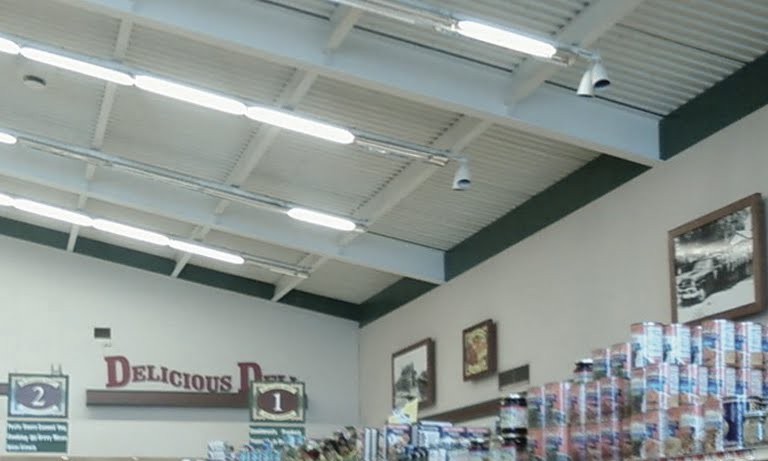
This decor package has hints of the Chalkboard Market look but oddly does not include department signage except for the "Delicious Deli". The black and white photos along the walls are of local buildings and attractions. Some of the stores have framed illustrations as well.

The Delicious Deli in the former Jersey City store. This location had the 80's Remodel until it was switched out for the Neighborhood Market decor in the early 2000's. The checkerboard floor remained. Look closely on the aisle markers... "Acme Markets... Jersey City's Best".

Jersey City could have used a better wall color. The huge walls were a little on the drab side here.

Here's a closer look at the aisle marker.

The "Dairy" cow. It's unfortunate that this store didn't have bolder department signage. Produce and Bakery had no signage whatsoever. The wood trim around the store had to be left off on the areas where the walls curve. The curves were standard issue in late 70's and early 80's stores.


These are pictures from the Cape May store... the only store in the entire Acme chain to have a custom decor package. This store will be explored more fully on an upcoming post. The "Neighborhood Market" theme was taken to a whole new level here. The interior design of the store matched the new look of the exterior.