

Photos courtesy of Jacob V
Location:1 University Drive, Newark, Delaware

Just when I think I've seen it all, along comes the University Plaza Acme in Delaware. I believe this is a one-of-a-kind location. Originally built sometime in the late 70's/early 80's as a classic 33M store. It was then expanded in the late 80's and given an entirely new facade which I thought had only ever been used for newly built stores.
Things get even weirder on the inside. First off, there are remnants from no less than five décor packages. Stranger yet... the store maintained its classic 33M layout after being expanded in the 80's. I don't know of any other location that could be said for. Not sure how things played out here but my guess is the store was expanded and remodeled before new store construction really took off in the late 80's. Acme must not have fully committed to the new layout that was being used in new stores like Dover and Hockessin and decided to stick with their tried-and-true layout here. Kinda messes with my mind looking around this place because I know of no other Acme like it.
We'll be enjoying photos provided by Jacob V along with additional embedded photos from catnapped retail central.

The checkerboard floors from the 80's remodel remain in place. Some mixing of the colors which we have also seen in Cape May.

Customer Service in the front corner! Virtually in the same spot it would have been in before the late 80's expansion and remodel. Not sure why there's a black strip of tiles along the floor.

We've got some aisle Premium Fresh and Healthy aisle markers... at this side of the store. Hold tight for a mismatched batch on the other side. Odd line up of displays running along the first aisle and there's that black stipe of tile again.


The Deli and Seafood are swapped compared to the standard 33M layout. Notice the keystones left over from the 90's Red/White/Blue remodel above the Seafood sign.

The layout gets a little wonky here. A strange alcove in the Meat Department due to the expansion. Aisle 11 looks to be the start of the newer section of the store which extends further back than the original section.


These frozen food cases date all the way back to the 80's.

Aisle markers left over from the Alberstons Marketplace remodel. Premium Fresh and Healthy category markers along the top shelves.


Yet another strange twist... the Dairy has the Bakery flooring throughout rather than the light blue tiles used in all other 80's remodels.


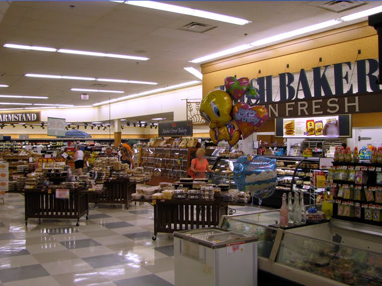
Fresh Bakery in the front corner! Once the standard placement for the department but completely done away with once the 33M layout was retired in the mid 80's.


Qualty Built checkout lights! Just to add one more element from yet another décor package. I believe this store is officially the most hodge podged store ever seen on the blog.

The front all of windows is oped to the whole front-end.

This area serves as an enclosed vestibule at most the stores with similar facades.

AERIAL VIEWS


You can clearly see here the expansion that happened to the right side of the store. You can also see where the mansard roof was located on the original store, now disguised by the updated facade.
HISTORIC IMAGES

2007

1992

1982

Wow. This is like an Acme melting pot. It must feel really disjointed in person, given there are elements, of 80s, 90s, 2000s and today's Acme.
ReplyDeletethe bear deleaware store had the same vestibule but it was enclosed to move the service desk up there, to allow the bank to go in that area.
ReplyDeleteThis store has been renovated, expanded with new construction on one side and I believe expanded into an existing store on the other side. I worked there in the past a d have been in and out if it on umpteen occasions and I cant remember all of the changes. If you think the sales area is different ,you should see the back room. The only ither stores that it re.inds me off, are Elkton and Kennett Square, both stores that were sisters to this one. THEY were both expanded , but they had vomplete packsge changes.
ReplyDeleteNice! I think this is the first time that we've viewed inside the greenhouse foyer. It's a little bit like an A&P Futurestore of some sorts... with the open windows in the front with a big store plan. Also, I'm surprised this store's sign didn't change out during the Albertsons Marketplace remodel. The signs with the red outline on the edges was mainly used on newly-opened or renovated 90's stores. Most stores have had theirs removed (See Lincroft, Ocean City (NJ-Pitched Roof), and Vineland commercial) in favor for the white letters, or white outline with red letters.
ReplyDeleteAbsolutely. There must have a been a time when big, heat-capturing glass vestibules were all the rage in grocery store design.
DeleteHaha, yep! My local Stop & Shop in Phillipsburg is like that, even though it was built in the late 90's. I actually like the design, and I think it would go great with the new UV coatings that some companies have come out with.
DeleteGrand Union had a similar glass fronted store (with all windows and a slanted section above of the roof in glass) around that timeframe (mid 1990's) as well.
DeleteIn fact there are still a few of those around that were taken over by other stores after their bankruptcy.
I have passed this store multiple times and thought I should go in to see what the inside looked like. The outside is so different from any ACME I've ever seen.
ReplyDelete