

Photos courtesy of Dan Asnis' flickr collection
Location: 5 Ortley Plaza, Ortley Beach, NJ

The temporary banner has been taken down and the permanent sign has been installed! The former A&P sign is still just covered over.

Interesting green stripe along the side. Leftover over from the "Sav-a-center" days?
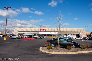
Hmmmm... ACME is not centered on the building.


Started off as an Acme sign in 1959, switched to A&P sometime in the 80s and BACK to Acme in 2015!
For full coverage of the Ortley Beach store, please click here.
I'm a little OCD. Why the heck isn't the ACME sign centered on the store? Why do you suppose they would hang it so off center?
ReplyDeleteSince it's above the old logo, it's most likely where the existing electrical wiring was; that was the place that required the least amount of effort to plug it in.
DeleteThat tiny sign looks silly on top of that big sign holder. It looks like it was meant to hold a big sign in the upper third (it is boxed in). Acme should have went big on that sign instead of using the old A&P signholder.
ReplyDeleteI wonder of at some of the newly-converted stores Acme is doing minimal work to the exterior for the moment because they intend to do more extensive remodeling at a later date.
ReplyDeleteThe other day when I was driving over the bridge to go to my new Acme, I could see the sign from a far distance. When I got closer and saw that the Acme letters were back in their original sign....at the risk of sounding corny, I almost broke into tears. I have pics of the A&P on there still, if anyone is interested.
ReplyDeleteI haven't seen that many shelf tags since A&P in the 1980s.
ReplyDeleteIf I remember correctly shopping there as a kid when we were on vacation, the sign tower had the typical Acme Markets 50's/60's era logo with the white letters on the blue background. I believe it took up the space between the top 2 crossbeams. It was visible for a long distance. Wish I had some pictures of the sign and the old building before it was demolished.
ReplyDeleteI imagine the sign back in the day must have looked a little like this one from the abandoned Egg Harbor City location. http://4.bp.blogspot.com/_246OMBI86f8/SdpCMVoqFEI/AAAAAAAAApw/5TxdYe05ADc/s1600-h/acme_market_egg_harbor_19.jpg
DeleteYou're probably right about that. I wish Acme would do a little more with these exteriors, especially if a remodel isn't happening in the immediate future. It's been almost a year, now the honeymoon is kinda over.
ReplyDelete